Reading Chart Images in R
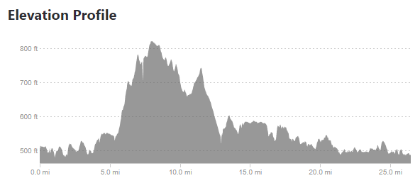
August 6th, 2019I ran into a non-computer issue recently – a marathon I was going to run had no hill profile on the race’s website. Many runners, myself included, use hill profiles to gauge how we want to run a race. For example, the Cincinnati Flying Pig is one where many runners would want to keep their pace moderated during the first 6 miles because miles 7-9 are a ginormous hill.
Since the race didn’t have an elevation profile on their website, I looked elsewhere for information, and came upon several Strava results that include an elevation profile. This is good, but I wanted to take it one step further and compare the marathon I was going to run – the Toledo Glass City Marathon – to one I had already run – the Cincinnati Flying Pig Marathon.
Taking the above images requires a few steps. The first is simply cropping down to the chart area.
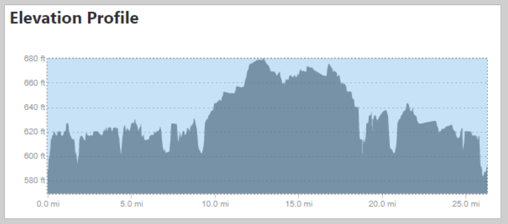
Cropping down the image to just the needed area 
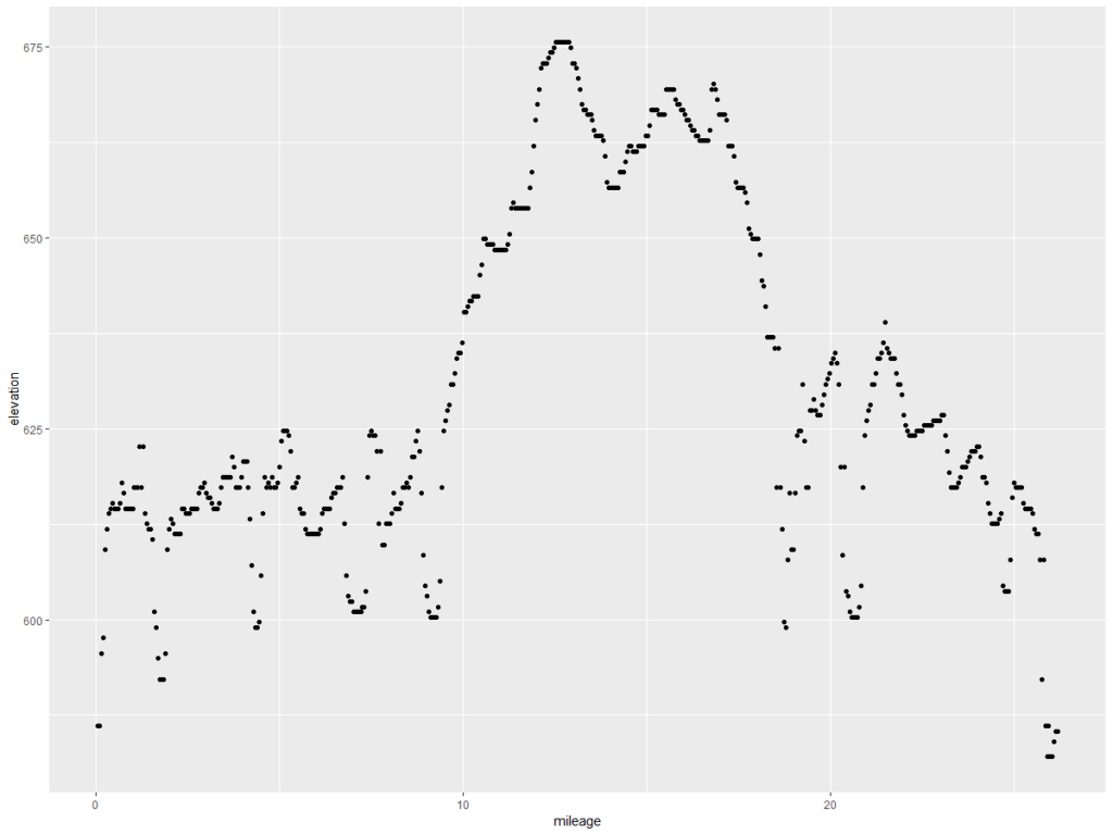
Flying Pig Profile 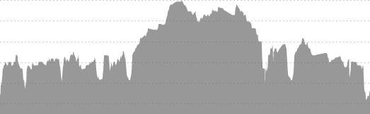
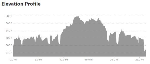
Glass City Profile
The next step is to read in the pixel data. This requires the imager package in r (install.packages("imager"))
The first part of the code below loads the libraries and reads the files in as greyscale.
library(imager)
library(ggplot2)
library(dplyr)
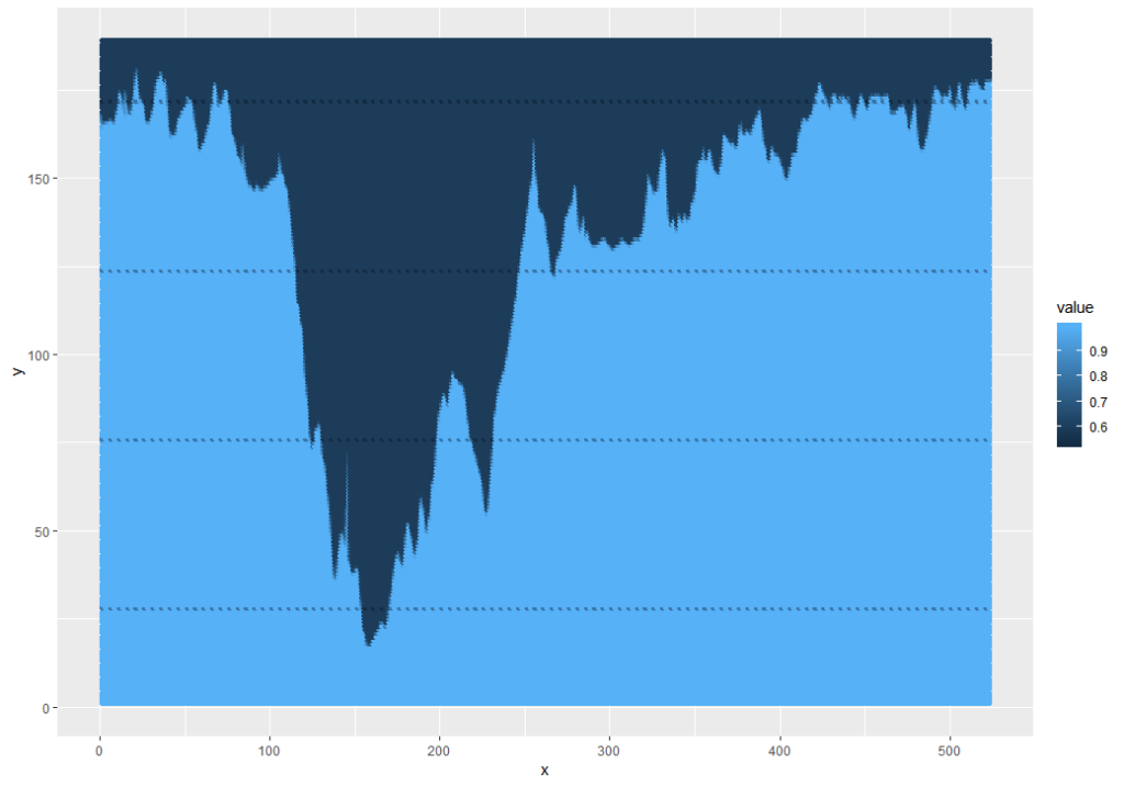
fpm.ei = grayscale(load.image("Pictures\\FPM_HillProfile_IR.png"))
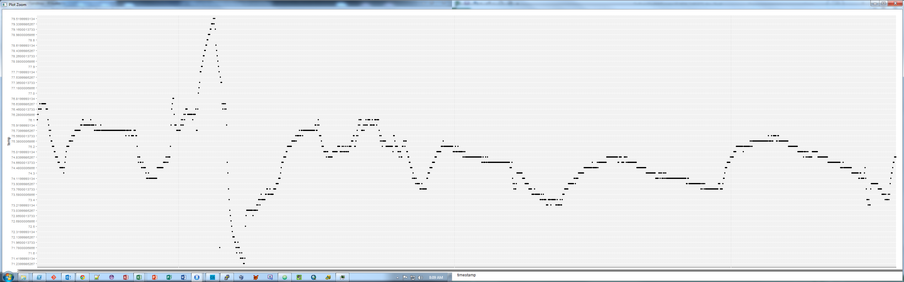
gcm.ei = grayscale(load.image("Pictures\\GCM_HillProfile_IR.png"))The values are input as a matrix indexed with the 0,0 point at the upper-left corner of the image and a value that relates to an estimate of. This means that an initial plot looks upside-down.
This can be fixed and simplified by using the ggplot2 snip below, and while I was at it, I pulled out the grey background and factored the values to 1 (dark) or 0 (light):
ggplot(as.data.frame(fpm.ei), aes(x = x, y = y, color = as.factor(ifelse(value<0.88, 0, 1)))) +
  geom_point() +
  scale_y_reverse()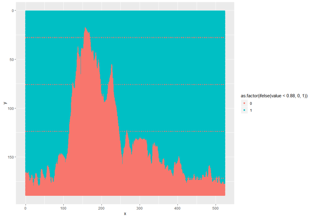
Note: 0.88 was used because the mean of the data is 0.8812. 0.5 wouldn’t work because the min is 0.5294 – this is because the foreground is grey, not black.
The next part is some processing. The processing does a few things:
- Do a gradient along the y axis – this removes the dashed lines
- Filter the matrix to just the black areas
- Get the minimum of the y axis location to get the contour of the line
fpm.gr <- imgradient(fpm.ei,"y")
fpm.grdf = as.data.frame(fpm.gr) %>%
  filter(value == 0)

fpm.grdf2 = fpm.grdf %>%
  group_by(x) %>%
  summarize(y = min(y))
To analyze, we need to relate the pixels to actual values. The x direction is easy – I used 0 and 26.2, the official distance of a marathon. The y direction is not, so I looked at the pixels and measurements from the images and related the pixels to an elevation – in the case of the Flying Pig, y = 27 => 800 feet MSL and y = 171 => 500 feet MSL. Since these are linear models (1 pixel = x feet), I used a linear model. Glass City’s values are 28 => 660 feet MSL and 146 => 580 feet MSL.
lmFP = lm(yy ~ y,
  data.frame(y = c(27, 171), yy = c(800, 500))
)

summary(lmFP)

fpm.grdf2$elevation = predict(lmFP, newdata = fpm.grdf2)

ggplot(fpm.grdf2, aes(x = mileage, y = elevation)) + geom_point()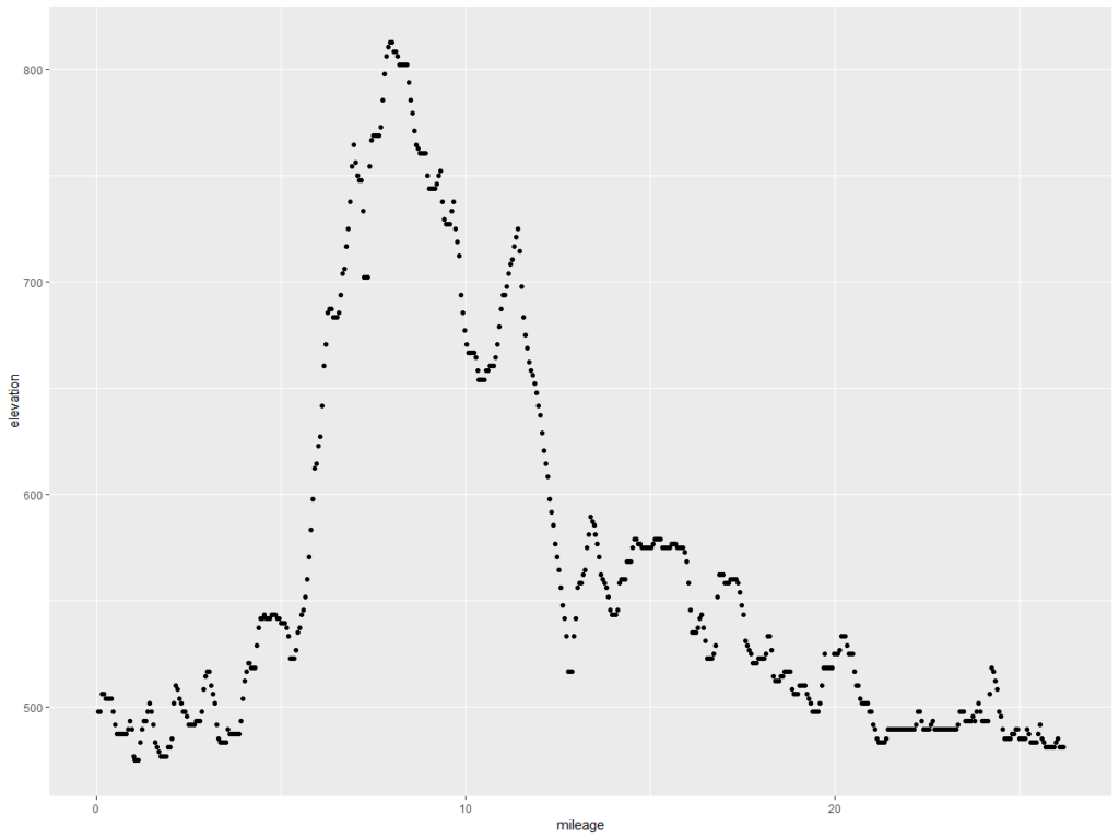
This is what we want – the elevation points! Note the y axis is elevation in feet and the x axis is the mileage of the marathon. Doing the same exercise with the Glass City Marathon elevation chart yields this…
Let’s compare them, shall we? The code below formats the data, and then draws a chart.
compareM = rbind.data.frame(
  fpm.grdf2 %>%
    arrange(mileage) %>%
    mutate(Marathon = "Flying Pig",
           elevationGain = elevation - lag(elevation, 1)),
  gcm.grdf2 %>%
    arrange(mileage) %>%
    mutate(Marathon = "Glass City",
           elevationGain = elevation - lag(elevation, 1))
)

ggplot(compareM, aes(x = mileage, y = elevation, color = Marathon)) + geom_line(size = 1.2) +
  ylab("Elevation in Feet MSL") +
  xlab("Miles") +
  ggtitle("Marathon Elevation Comparison", "Flying Pig (Cincinnati) vs. Glass City (Toledo)")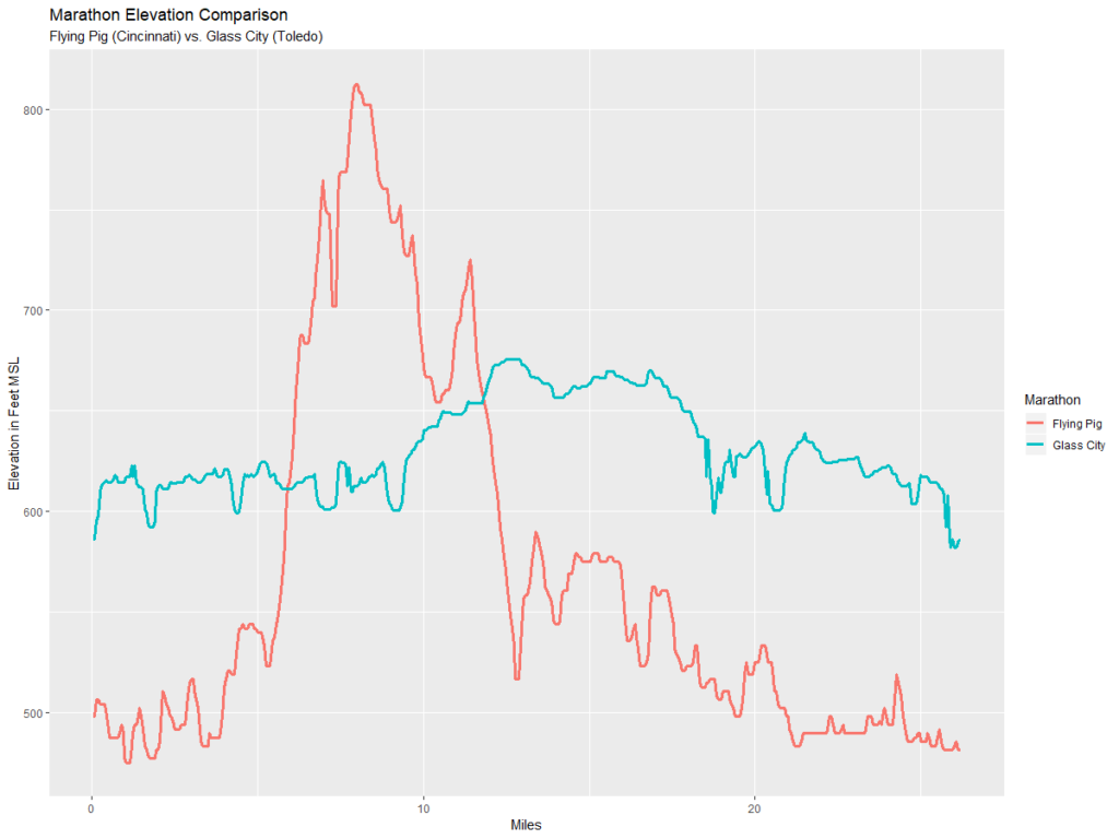
So the chart above shows that the Glass City is mere child’s play compared to the Flying Pig.


You must be logged in to post a comment.