Dumping TransCAD Matrices to OMX

October 20th, 2022

I ended up in a position where I needed to dump a bunch of TransCAD matrix files to OMX files. This is a useful little script that scans all the matrices in a folder (presuming they use the .mtx file extension) and write them out as matrices.

Macro "convertMtx"(Args)
    base_folder = "C:\\your\\path\\here"
    di = GetDirectoryInfo(base_folder + "\\" + folders[fi] + "\\*.mtx", "File")
    for i = 1 to di.length do
        m = OpenMatrix(base_folder + "\\" + folders[fi] + "\\" + di[i][1], )
        matrix_info = GetMatrixInfo(m)
        parts = SplitPath(base_folder + "\\" + folders[fi] + "\\" + di[i][1])
        omx_filename = parts[1] + parts[2] + parts[3] + ".omx"
        mc = CreateMatrixCurrency(m,matrix_info[6].Tables[1],,, )
        new_mat = CopyMatrix(mc, {{"File Name", omx_filename},{"OMX", "True"}})

    end
endMacro

I’m not sure if there is a better way to do this, but this works well enough once compiled and run in TransCAD 9.

Anaconda Hacks (for ActivitySim… sort of)

August 16th, 2021

Anaconda is making me hate Python a little less… only a little. If I’m going to work with ActivitySim (which I am), it’s necessary.

1 The first hack is setting MKL_NUM_THREADS automatically. According to this page, it should be set to one thread to avoid things going nuts (that’s a technical term). Doing this is pretty easy, since Anaconda is setup to run all the scripts in a folder upon activation (there’s a deactivation folder too). To get to this, open the Anaconda prompt and activate the appropriate workspace. Then type echo %conda_prefix%. Copy (highlight and right-click) the resulting path and paste into a Windows Explorer Window. Navigate to etc – conda – activate.d. Make a file (e.g. asr-activate.bat) – this is a Windows batch file that will run when the workspace is activated.

In this batch file, add MKL_NUM_THREADS=1 (note: NO SPACES AROUND THE EQUALS SIGN!). This will set that when the workspace is activated.

2 Another hack in that same file is sending the command line to your working directory (I have a workspace for each client, since we sometimes have to use different versions of ActivitySim or other packages), so I added (each on their own line) D: and cd D:\Projects\Clients\FavoriteClient\Tasks\asim_setup. Now, when I open the Anaconda Shell and activate that workspace it automatically sends me where I want to be.

In the case that I needed to unset that MKL_NUM_THREADS, navigating ‘up a level’ and to deactivate.d (%conda_prefix%\etc\conda\deactivate.d), you can make a deactivate script (e.g. asr-deactivate.bat) and use MKL_NUM_THREADS= and it will clear the variable when the workspace is deactivated.

Note: There are probably several files already in the activate.d and deactivate.d folders, and you might notice that there’s a bunch of .sh files. These are for Linux (and probably MacOS). They work the same way, but I didn’t mess with them because I’m running on a Windows 10 computer.

Reading Chart Images in R

August 6th, 2019

I ran into a non-computer issue recently – a marathon I was going to run had no hill profile on the race’s website. Many runners, myself included, use hill profiles to gauge how we want to run a race. For example, the Cincinnati Flying Pig is one where many runners would want to keep their pace moderated during the first 6 miles because miles 7-9 are a ginormous hill.

Since the race didn’t have an elevation profile on their website, I looked elsewhere for information, and came upon several Strava results that include an elevation profile. This is good, but I wanted to take it one step further and compare the marathon I was going to run – the Toledo Glass City Marathon – to one I had already run – the Cincinnati Flying Pig Marathon.

This is a screenshot of the elevation profile from the Flying Pig Marathon from my Strava race in 2018
This is a screenshot of the elevation profile of the Glass City Marathon from some random runner’s Strava upload of the race

Taking the above images requires a few steps. The first is simply cropping down to the chart area.

The next step is to read in the pixel data. This requires the imager package in r (install.packages("imager"))

The first part of the code below loads the libraries and reads the files in as greyscale.

library(imager)
library(ggplot2)
library(dplyr)

fpm.ei = grayscale(load.image("Pictures\\FPM_HillProfile_IR.png"))
gcm.ei = grayscale(load.image("Pictures\\GCM_HillProfile_IR.png"))

The values are input as a matrix indexed with the 0,0 point at the upper-left corner of the image and a value that relates to an estimate of. This means that an initial plot looks upside-down.

This can be fixed and simplified by using the ggplot2 snip below, and while I was at it, I pulled out the grey background and factored the values to 1 (dark) or 0 (light):

ggplot(as.data.frame(fpm.ei), aes(x = x, y = y, color = as.factor(ifelse(value<0.88, 0, 1)))) + 
  geom_point() + 
  scale_y_reverse()
This is the elevation profile

Note: 0.88 was used because the mean of the data is 0.8812. 0.5 wouldn’t work because the min is 0.5294 – this is because the foreground is grey, not black.

The next part is some processing. The processing does a few things:

  1. Do a gradient along the y axis – this removes the dashed lines
  2. Filter the matrix to just the black areas
  3. Get the minimum of the y axis location to get the contour of the line
fpm.gr <- imgradient(fpm.ei,"y")
fpm.grdf = as.data.frame(fpm.gr) %>%
  filter(value == 0)

fpm.grdf2 = fpm.grdf %>%
  group_by(x) %>%
  summarize(y = min(y))

To analyze, we need to relate the pixels to actual values. The x direction is easy – I used 0 and 26.2, the official distance of a marathon. The y direction is not, so I looked at the pixels and measurements from the images and related the pixels to an elevation – in the case of the Flying Pig, y = 27 => 800 feet MSL and y = 171 => 500 feet MSL. Since these are linear models (1 pixel = x feet), I used a linear model. Glass City’s values are 28 => 660 feet MSL and 146 => 580 feet MSL.

lmFP = lm(yy ~ y,
  data.frame(y = c(27, 171), yy = c(800, 500))
)

summary(lmFP)

fpm.grdf2$elevation = predict(lmFP, newdata = fpm.grdf2)

ggplot(fpm.grdf2, aes(x = mileage, y = elevation)) + geom_point()
Elevation profile as points

This is what we want – the elevation points! Note the y axis is elevation in feet and the x axis is the mileage of the marathon. Doing the same exercise with the Glass City Marathon elevation chart yields this…

Let’s compare them, shall we? The code below formats the data, and then draws a chart.

compareM = rbind.data.frame(
  fpm.grdf2 %>%
    arrange(mileage) %>%
    mutate(Marathon = "Flying Pig",
           elevationGain = elevation - lag(elevation, 1)),
  gcm.grdf2 %>%
    arrange(mileage) %>%
    mutate(Marathon = "Glass City",
           elevationGain = elevation - lag(elevation, 1))
)

ggplot(compareM, aes(x = mileage, y = elevation, color = Marathon)) + geom_line(size = 1.2) +
  ylab("Elevation in Feet MSL") +
  xlab("Miles") +
  ggtitle("Marathon Elevation Comparison", "Flying Pig (Cincinnati) vs. Glass City (Toledo)")

So the chart above shows that the Glass City is mere child’s play compared to the Flying Pig.

Geoprocessing In R – Identify Points on a Polygon Layer From Survey Data

August 24th, 2018

What happens when you have a bunch of survey data with GPS points, and you want to do Geoprocessing?

This process sucks as bad as my picture of my pencil sketch!

THERE IS AN EASIER WAY!

To start – I’m not sure if this is truly necessary but it seems like a good idea – convert your identify layer (TAZs, for example) to the same coordinate system as your points (likely WGS 1984, which matches GPS coordinates).

Then, load the sf package in R:

install.packages("sf") #only needs to be done once
library(sf)

To read the identity layer, use:

taz = st_read("gis/tazlayer.shp")

Once that’s loaded, doing the identity process is simple:

joined_df = st_join(st_as_sf(surveydf, coords = c("LongitudeFieldName", "LatitudeFieldName"), crs = 4326, agr = "field"), taz["TAZ"])

What this does:

  • st_as_sf is the function to turn another object into an sf object
  • The surveydf is the survey dataframe (you’ll want to change this to match whatever you have)
  • coords = c(“LongitudeFieldName”, “LatitudeFieldName”) tells st_as_sf the names of the coordinate fields
  • crs = 4326 tells st_as_sf that the coordinates are in WGS1984 – if your coordinates are in another coordinate system (state plane, for example), you’ll need to change this
  • agr = “field” tells st_as_sf the attribute-to-geometry relationship. In this case, the attributes are constant throughout the geometry (because it’s a point)
  • The taz[“TAZ”] is the second part of the join – we’re joining the points to the TAZ layer and only taking the TAZ field (this could be expanded with something like taz[c(“TAZ”, “AREATYPE”)])

One caveat – the return of this (what joined_df will be after the above function is run) is a collection of geometry objects, so when joining to table data, it is best to take a data frame of the object… a la:

library(dplyr)

df_out = df_in %>%

    left_join(as.data.frame(joined_df), by = "idField")


This is much faster than loading ArcMap or QGIS to do this work, and it keeps everything in one script, which makes life easier.

Building Better Desire Lines in QGIS (using AequilibraE)

July 20th, 2018

Ever build desire lines that just SUCK?

This is just nasty

There’s a solution – AequilibraE’s Delaunay Triangles. Pedro’s method can turn the above into this…

Same data as above – but much more intelligible

The One-Time Startup Process

  1. Install QGIS 2.18.12 from www.qgis.org
  2. Make sure it runs correctly (see the notes below)
  3. Activate the AequilibraE plugin (Plugins - Manage and Install Plugins – Check “AequilibraE”)

The Process

  1. Import the shapefile geography – the Add Vector Layer on the left side
  2. Import the data table – same button as above (see notes below)
  3. Convert the data table to a matrix (probably optional, but a good step to do) – AequilibraE – Data – Import Matrices
    1. Select ‘Open Layer’, make sure Matrix is the data table, and that the From, To, and Flow match the fields in the data table
    2. Click on ‘Load’, it’ll load the data
    3. Click on ‘Save’ and save the data to an aem file
    4. BE PATIENT! Mine will hang on ‘Reblocking matrices’ for quite a while, and will not write to the file for several minutes, but the CPU would still be getting drilled by QGIS. The window will close itself when complete.
  4. Open AequilibraE – GIS Tools – Desire Lines
    1. Zone or Node Layer should be your zone geography
    2. ID Field should be whatever field your TAZ numbers are in
    3. Click on ‘Load Matrices’ and select your aem file
    4. Make sure ‘Delaunay Triangles’ is selected. Unless you want a mess.
    5. Click on ‘Build Desire Lines’
    6. Be patient – it can take a few
    7. Visualize the resulting desire lines (e.g. put a width on them or a color)


Notes

  1. I had a lot of problems with DLLs not loading and various things not being available. To remedy this, I had to fix my PATH, PYTHONHOME, and PYTHONPATH environment variables. In my case, I put @cpython@ at the end of my PATH statement (’…C:\RBuildTools\3.5\bin;%cpython%’) and I rename the cpython variable as necessary (I have a cpython, which is the current-in-use, and cpython.arcgis). I use a similar tactic with PYTHONPATH and PYTHONHOME.
  2. I had a few issues with data I was exporting from R. Make sure you have no N/A values in your data. It’s not a bad idea to check it in another program before using it in AequilibraE.

Python Telnet and \xff = 🤮

May 23rd, 2018

After trying to make node.js do what I think node.js is not meant to do (or I just don’t want to sink more time to figure how to make it do what I really think it’s not meant to do)*, I decided maybe I’d try Python. This relates to yesterday’s Promise Chain Pain.

As usual, that was a mistake.

I decided to send a self-test line to one of the Ohio River Bridge Counters, which is a hex line of ‘ff aa c0 02 00 02 00 02’. However, as I watched in WireShark, it was sending ‘ff ff aa c0 00 02 00 02’. The extra ‘ff’ at the beginning is a problem.

This is what my computer is sending

So I looked at the documentation, which led to the source code.

WTF?

Apparently, any “IAC” characters are doubled.

OhFFS

Apparently, char(255) is “IAC”, and the hex character ‘ff’ is 255.

Yeah, \xff = 255. We already knew that, I just wanted to prove it.

Back to the drawing board…

Update: I’m probably being a little mean to Python. It’s the language I love to hate. I CAN use the socket package to work with these counters, so I might be good. Might.

That’s how I mostly feel about Python. Tie it to a stick to keep it out of the way for a while.


‘* = I’m not trying to rip on Node.js here. While there’s some things that baffle me with it (like the lack of errors for forgetting semicolons and the few occasions where I looked back at something and wonder how it ever worked), I have been enjoying Node.js and will likely be using it more.

Node.js Promise Chain Pain

May 22nd, 2018

I’m working with some node scripts that are able to pull data from remote traffic counters. I might be using the wrong tool for the job.

In the process of understanding and troubleshooting, I am simulating the process of remote data collection with just some setTimeouts and debugs in node, as such:

debug('start');
new Promise(function(resolve, reject){
setTimeout(() => resolve(1), 1000);
}).then(function(result){
setTimeout(() => debug(result), 1000);
return result * 2;
}).then(function(result){
setTimeout(() => debug(result), 1000)
return result * 2;
});

And that yielded this when run:

debug('start');
new Promise(function(resolve, reject){
setTimeout(() => resolve(1), 1000);
}).then(function(result){
setTimeout(() => debug(result), 2000);
return result * 2;
}).then(function(result){
setTimeout(() => debug(result), 1000)
return result * 2;
});

Which yielded this when run. Note the order of the answers as well as the times…

It’s interesting how this is working. I’m coming to the conclusion that it’s not the correct tool for what I’m doing (the asynchronous nature of this is making it difficult to avoid flooding modems that have two counters on them).

RMarkdown Reports with Good Looking Tables

February 7th, 2018

This is how a table should look


Like it says, this is *not* how a table should look!

It seems to me the only purpose of using RMarkdown is to make nice looking reports from data (and don’t get me wrong, that’s EXTREMELY IMPORTANT – what good is data if it can’t be communicated). Graphics look nice, but sometimes you need to see a table.

Enter two things: kableExtra and LaTeX.

kableExtra is simple to use:

library(kableExtra)
knitr::kable(theTableToShow, "html") %>%
kable_styling(bootstrap_options = c("striped", "hover"))

Yeah, it’s that simple! And there are options, too.

However, using Greek letters is a tad (only a tad) more difficult:

row.names(okisum) = c("Region", "$\\sum Volume$", "$\\sum AADT$", "$\\Delta$", "Pct", "$r^2$")

The “$\sum” refers to the symbols listed on this page (and there’s more, just do a web search for LaTeX Math Symbols and there’s hundreds of guides on what is available).  The one change is the extra backslash needed in R to escape the text.

The last part is the text formatting. I did this with the r format command:

format(round(as.numeric(table$AADT), 0), nsmall=0, big.mark=",")
paste(format(round(as.numeric(100 * table$Pct), 2), nsmall=0, big.mark=","), "%", sep="")

Note that this needs to be the last step, since the output of format is text. The first line rounds to no decimal points and adds a comma. The second line rounds 100*percentage to 2 decimal points and pastes a percent sign after it with no separator.

While this may seem menial, I’ve heard of many stories where management/leaders/etc didn’t want to believe something scrawled on a piece of paper, but when the same information was printed nicely on greenbar dot matrix paper, it was accepted as excellent work.

I Built a Twitter Bot

January 23rd, 2018

I make the occasional joke on Twitter about making a Twitter Bot.  I recently saw a tweet from The Practical Developer (ironically, that’s probably a bot itself… and I saw a retweet of the original tweet on January 22, 2017):

The code is pretty easy, particularly if you don’t do the same bot the author did.  I made it pretty simple – instead of retweeting and quoting tweets, I’d just tweet a random number:

Simple.  It tweets every 10 minutes with a random number. Sometime I will do more. I’m just not sure what yet.

Finding Stuff in Big CSV Files

October 16th, 2017

If you have an activity based model OR big(ish) data, from time-to-time, you need to find something. One record, possibly one in half a million or one in a million. You need GNUWin tools for these if you’re on Windows.

Getting the First Line

Getting the first line is pretty easy with the head command:

>head -n 1 file.csv

>head -n 1 jointParticipantResults.csv
id,tourid,hhid,hhsize,purpose,partytype,participantNo,pNum,personType,HhJoint

If you want the last, record, replace ‘head’ with ‘tail’.

Getting the Number of Rows

This is a pretty simple awk script that returns the number of rows:

>awk 'END {print NR}' jointParticipantResults.csv

Getting a Specific Record

This is a simple awk script that returns the row where the  third field is 158568.  Looking at the first script above, the third field is the hhid field:

>awk '$3 == 158568 {print $0}' FS="," jointParticipantResults.csv

Note the FS part – that tells awk that the field separator is a comma.

GnuWin32 Trick: Quickly Finding Text in File

June 1st, 2017

The downside of not managing a good library of scripts is forgetting where some code is written.  Case in point: I wrote a nice RMSE script, but I forgot where it was.

So I found it with the following command line:

grep "rmse" $ls -R ./*/*.R ./*/*.r

The first part of the script – grep “rmse” – tells the grep command to look for rmse.  The second part – $ls -R .//.R .//.r – tells what files to look through (that command is list recursive looking for *.R and *.r files).

Updating Fields In One Table From Another in FoxPro

March 20th, 2017

With Microsoft products dropping support for DBF files, I’ve been using FoxPro 7 much more now.

One of the more annoying things in FoxPro (and maybe other systems) is when you update a DBF field from another, a simple UPDATE query does not work.  You need to use:

SET RELATION TO table.field INTO otherTable
REPLACE destField WITH otherTable.field FOR table.joinField = otherTable.joinField

This is a fairly annoying way to do it, but it works.  Both statements are required.

Cheers!

Debugging Programs on Remote Systems with Windbg

November 14th, 2016

Recently, we ended up with problems with a program that writes a report from the model, but the problem only occurs on the model server, .  The error messages were nice and descriptive

This is the primary error shown on the screen. I can assure you that nothing in the lower text area (that can be scrolled) indicates what the error actually was.

This is the primary error shown on the screen. I can assure you that nothing in the lower text area (that can be scrolled) indicates what the error actually was.

This is only slightly helpful.

This is only slightly helpful.

Enter the .Windows Debugger, windbg.

On the server (where this program was running), we had the executable file, the PDB file (which is built with the executable), and the source code (which I don’t think was used).

We opened the debugger and used it to open the executable file.

The commands generally went like this:

.sympath+ C:\Modelrun\Model81\
.srcpath C:\Temp\ModelReport76\ModelReport76
(debug menu - resolve unqualified symbols)
.reload
x ModelReport76!*
g
!analyze -v

The first two lines set the symbol path to the PDB file and to the source.  The x ModelReport76!* loaded some program stuff into memory.  ‘g’ tells the debugger to run the program.  !analyze -v dumps an analysis to the screen.

The analysis didn’t really tell us anything, but what did was what ended up on the actual program window:

Note the source code filename and the line...

Note the source code filename and the line…

On that particular line of the source code, the program is attempting to create an Excel sheet.  The model server does not have Excel/Microsoft Office, so that’s likely the problem.

ArcMap Showing Negative Values?

October 6th, 2016

This post is an actual exaggerated account of events in the office.  Names of the innocent have been protected.

I’m sitting in my office working on a way to streamline checking data from a large and terrible organization and I click on one of our links and see the worst possible thing: a negative AADT (Annualized Average Daily Traffic, basically a traffic count!).

AADT’s can’t be negative. They’d cause a rift in the space-time continuum.

After screaming across the aisle to the poor soul that has to fix things like this (who replied with an exacerbated “WHAT?” when I said “Hey, why are the AADT’s negative on the Big Mac Bridge?” and we both checked the model output to see that, indeed, the model output claims that the AADT is positive, I started looking further into the problem.

I started with FoxPro (I may be the last person with FoxPro installed on their computer, but IT can uninstall it over my cold dead body AND after removal of my ghost) and found that the AADT should be 44,043 (in one direction).

Then I remembered that we’ve had this problem before, but I thought that bug was fixed (silly me for thinking multiple-year-old bug get fixed).  I looked into it on the web and found a statement from one of ESRI’s own indicating that the problem is with ArcWhatever* converting 5-width numbers in DBFs to be short integers (which range from -32,767 to 32,767).  44,043? Too big, so the number gets displayed incorrectly.

The fix is surprisingly simple: change the width of the field in FoxPro from 5 to 6.

That 5, it's bad! Make it a 6.

That 5, it’s bad! Make it a 6.

Once the fix is made, the data is displayed as a 32-bit integer.

Fixed!

Fixed!

Notes:

  • I first saw this with a data layer served by ArcServer. Or ArcSDE. Heck, I don’t know the difference, I just ask our GIS department for a REST endpoint and they take care of me and that’s where I actually saw this.

Quickie: WMV Screen Captures and Animated GIFs

August 11th, 2016

Occasionally, I do screen captures.  I use the Microsoft Expression Encoder.  It’s not pretty, but I think it’s free.  The output, by default, is a WMV (Windows Media Video) file.

YouTube is perfectly okay with WMV files.  However, for an animation to show up in Twitter, it has to be an animated GIF with a limit of 5 MB.

Enter ImageMagick:

convert -resize 50% -deconstruct -layers optimize inputFile.wmv outputFile.gif

This took a 14-20 MB animated GIF (uncompressed) to 1.36 MB.  Which is nice, because then I can show gems like this:

Cheers!

XKCD-style Plots In R

May 17th, 2016

Because XKCD is cool…

Note that the data is totally made up.  Well, except that it certainly feels pretty well correct, given the Delta flights I was on going both to and from Denver…

Resulting Plot

Resulting Plot

Animated Charts from R

April 29th, 2016

In any iterative process, it is nice to see progress.

Recently, it was gravity model distribution (again), so I had a process in R to calibrate friction factors, and part of it exported the trip length frequency chart:

ggsave(paste("TLF", Purpose, Period, "_Iter", iteration, "plot.png", sep=""))

So I was left with 30 charts showing progress.  So for kicks (a little), I animated the charts using ImageMagick:

One of the charts

One of the charts. Click for larger and animated.

To do this, you need Imagemagick (scroll down for Windows) and the following command line:

convert -resize 75% TLFHBWOP_Iter%dplot.png[1-30] HBWOP.gif

The resize parameter is optional, I used it to reduce the image size down to something allowable by Twitter.

Running Cube Scripts from R Scripts

April 26th, 2016

From time to time, it makes sense to not re-invent the wheel by building something in R that is already available in another program, like Cube Voyager.

This is incredibly easy:

system("voyager.exe script.S /Start /CloseWhenDone")

That’s it!  BUT…

If you want the output from a matrix available to R, the last line of your Cube script should include something like:

*cube2omxw output.mat

This will convert the output matrix to an omx file.  The star runs it from the command prompt.

Important requirements: voyager.exe and cube2omxw.exe must be in your path.


Simple Heatmap in R with ggplot2

March 18th, 2016

Heatmaps are an easy way to look at data when you have a lot.  The heatmap below is from a 30 day traffic count.  You can easily and quickly see that peaks in the morning are northbound, peaks in the afternoon are southbound, and peaks on the weekend are in the midday.

Heatmap

Heatmap

There isn’t a ton of code needed to do this:

Data to play with

This method could be used with shorter-term data with fewer steps.  I used this 30-day count because it tells more of a story than a two or three day count.

Announcing The Ruby OMX API

October 23rd, 2015

I am happy to announce that there is now a Ruby API for OMX.  This is a read-only API that supports a few ways of reading a matrix, returning an array of J for a given I, an array of I for a given J, and returning the value at a matrix address.

More documentation is available on Github (including the all-important install instructions).

Let me know if you have any questions.  Post issues and bugs to the Github issues tracker.

The motivation behind yet-another-API, Ruby seems (operative word!!!) that it handles being a web-based API better than a lot of other languages.  I’ve built a few just to test things out – for example, I built a versioned API that responds with random quotes from Yogi Berra… And please don’t build that in to anything, I have the free Heroku plan, so that may disappear at a random time!  Aside from the time that it took to adapt my mess of Voyager+Java+C+++Python(GRRR!)+Basic syntax to Ruby, it wasn’t at all difficult and it is incredibly easy to add another API version.  I would like to have a semi-live map of skims that I can click on a zone and see colors for the selected attribute/matrix (e.g. travel time).

R + OMX County Flows

October 8th, 2015

In travel modeling, we use matrices to do things like zone-to-zone trip flows.  The matrix is like a table, but with an equal number of rows and columns, each representing a location in the model (a traffic analysis zone, like a Census Block Group).  In the OKI region, we have 2,299 zones, which means there are 5,285,401 cells.  Too many to look at, and we don’t have reliable data at that level.  However, we do have semi-reliable data at the county level.

The Open Matrix Format (OMX) is used to get these matrix files out of a proprietary format and into something that can be read by many programs.  We use this at OKI to move data out of Cube (a proprietary software product) and into R (an open source statistical programming package).

Summarizing a matrix to a county flow table in R is actually pretty easy:

This doesn’t take very long, either.  Anyone familiar with R can see where the code can be revised to summarize to districts.

This is what the data looks like. Note that this is not verified data (please do not use it!).

This is what the data looks like. Note that this is not verified data (please do not use it!).

Note: the reason Hamilton, Campbell, and Dearborn county names are cut off is related to a bug in Cube.  They (Citilabs) are aware of the bug, but it has not been fixed yet.

Standard Deviation Differences Between Excel and R (and my code in Cube Voyager)

July 24th, 2015

I had a need to get the correlation of count to assignment in Cube Voyager. I don’t know how to do this off the top of my head, and I’m instantly mistrusting of doing things I’d normally trust to R or Excel. So I looked on Wikipedia for the Pearson product-moment correlation coefficient and ended up at Standard Deviation. I didn’t make it that far down on the page and used the first, which generally made Voyager Code like this:

I left the print statements in, because the output is important.

Avg AADT_TRK = 1121.77
Avg VOLUME = 822.03
n = 230.00


sdx1 = 1588160175
sdy1 = 1196330474
n = 230.00
sd AADT_TRK = 2627.75
sd Volume = 2280.67
r2 = 155.06

Note the standard deviations above. Ignore the R2 because it’s most certainly not correct!

Again, mistrusting my own calculations, I imported the DBF into R and looked at the standard deviations:

> sd(trkIn$AADT_TRK)
[1] 2633.476
> sd(trkIn$V_1)
[1] 2285.64

Now Standard Deviation is pretty easy to compute. So WHY ARE THESE DIFFERENT?

Just for fun, I did the same in Excel:

Screenshot 2015-07-24 11.09.18
WTF? Am I right or wrong???

So I started looking into it and recalled something about n vs. n-1 in the RMSE equation and discussion in the latest Model Validation and Reasonableness Checking Manual. So I decided to manually code the standard deviation in Excel and use sqrt(sum(x-xavg)^2/n-1) instead of Excel’s function:

Looky there!  Matching Numbers!
Looky there! Matching Numbers!

It’s not that Excel is incorrect, it’s not using Bessel’s Correction. R is.

/A

Running Python in Atom.io in Windows

June 25th, 2015

I already hate Python, but their “IDE” makes it worse.  Fortunately, Atom.io can fix the IDE problem.

2_printHelloWorld

Atom.io is a Github product that whips the IDLE Python’s ass.  It’s not actually an IDE, it’s  a text editor, but it’s a text editor on steroids.

I stumbled upon a plugin for Atom to run various languages right in the window, including Python.  The problem is that it doesn’t work right out of the box in Windows.  Fixing this is easy:

  1. Go to File – Settings (you can also press CTRL+,)
  2. Select Install
  3. In the search box, type “script” and it should come up after a few seconds
  4. Click install

Once it is installed (which should take less than a minute on a modern Internet connection), you will need to update the startup script to fix the path.  To do that:

  1.  Go to File – Open Your Init Script
  2. Add the following line

process.env.path = [“C:\Python27\ArcGIS10.2”,process.env.PATH].join(“;”)

NOTE: I’m using the ArcGIS-bundled Python – you may need to fix that path!

Once the init script is updated, close and re-open Atom, and you should be able to select Packages – Script – Run Script (or press CTRL+SHIFT+B) to run a Python script.

/A

(my hate for Python is well-known!)

R + OMX: Trip Length Frequency Plots

May 8th, 2015

If you don’t follow me on twitter or the Open Model Data site, you may have missed that Cube 6.4 makes some DLL changes that rendered the prior version of the Cube2OMX converter unusable.  I jumped in (partly because I installed Cube 6.4) and fixed the problem.  You can get the source or a binary on Github.

I did this because sending matrices to DBF files means that you’ll have a 500 MB DBF for a matrix that’s 3200+ zones.  Normal R routines chug on it.  On the contrary, OMX files are around 10% of that size (60 MB) and R can read them quite quickly – in a matter of seconds instead of minutes.

So the first thing I wanted to do in R with OMX files is Trip Length Frequency Plots.  This isn’t incredibly quick, but it works.  The code is below.  According to one run in R, it takes around 6 minutes to run (on 3,312 zones).  The largest part is the loop in the function, and this could probably be parallelized (is that a word?) using doParallel.

Code below or here

Happy Pi Day!

March 14th, 2015

Although τ is better, today is π.

Using the code from One R Tip A Day Twitter, I give thee 1,000 decimal places of π.

3.141592653589793238462643383279502884197169399375105820974944592307816406286

2089986280348253421170679821480865132823066470938446095505822317253594081284

8111745028410270193852110555964462294895493038196442881097566593344612847564

8233786783165271201909145648566923460348610454326648213393607260249141273724

5870066063155881748815209209628292540917153643678925903600113305305488204665

2138414695194151160943305727036575959195309218611738193261179310511854807446

2379962749567351885752724891227938183011949129833673362440656643086021394946

3952247371907021798609437027705392171762931767523846748184676694051320005681

2714526356082778577134275778960917363717872146844090122495343014654958537105

0792279689258923542019956112129021960864034418159813629774771309960518707211

3499999983729780499510597317328160963185950244594553469083026425223082533446

8503526193118817101000313783875288658753320838142061717766914730359825349042

8755468731159562863882353787593751957781857780532171226806613001927876611195

909216420199

And what is π day without the following video of Danica McKellar (Winnie from the Wonder Years) singing about π.

Yes, this posted on 3/14/15 at 9:27 (I couldn’t get seconds, so posting it at 9:26:54 was out of the question!)

/A

R Quick-Take: Reading a Ton of Files in a Few Lines

December 1st, 2014

I just downloaded 2,159 traffic count files over the Internet. I’m going to have to work with these in various ways.

So the following quick snippet of code reads all of them into one data frame:

Adventures in Model Validation: Why RMSE is NOT a Stand-Alone Measure

November 10th, 2014

It seems like the major component of model validation is Root Mean Square Error, or RMSE.  RMSE is basically this:

$$RMSE=\sqrt{\frac{\sum{(Count-Model)}^{2}}{N}}$$

And %RMSE is:

$$\%RMSE=\frac{RMSE}{\dfrac{\sum{Count}}{N}}*100 $$

These are useful measures to measure the error, but the problem with using them as a wholesale measure is that they ignore the DIFFERENCE of the error – this is evident in the numerator of the RMSE equation where the difference is squared. Any number squared becomes POSITIVE.

In the Model Validation and Reasonableness Checking Manual, the first item in assignment aggregate checks is VMT, as it well should be.  Consider the following scenario:

Two model runs, one with assignments 20-40% high, and the other with assignments 20-40% low, both compared to the counts.  They can have nearly the same RMSE (overall, it’ll probably be around 30% FOR BOTH), but the VMT will show one ~30% high and the other ~30% low.

Using R with Phant

November 3rd, 2014

Last week on another blog, I showed a way to connect a temperature and humidity sensor to a Beaglebone Black and read it using some Python code that ultimately started with Adafruit.

So to be able to play (a little) AND after complaining about my office temperature last week, I decided to plug this thing in at work and set it up with Phant, the IOT data service from Sparkfun.  Then I wrote a quick R script to get the JSON file and plot the temperature.

Plot of Temperature

Plot of Temperature

The code is below:

It’s pretty simple, although the plot could use me spending a bit more time on it… and perhaps limiting the data to the last hour or day or something.  All of that can be done within R pretty easily.  Also, I did make a file available for anyone that wishes to play (the file is NOT ‘live’, the Phant server is on a different network).

/A

Quick R Trick: Lists and Data Frames

October 24th, 2014

I didn’t know something better to call this, but you can use lists with data frames as variables to hold multiple field names:

MIN=c('NAICS21','NAICS22','NAICS23')

temp=maz[,MIN] #temp is now a data frame of all rows with just NAICS21, NAICS22, and NAICS23

temp=maz[,c("TAZ",MIN)] #temp is now a data frame of all rows with just TAZ, NAICS21, NAICS22, and NAICS23

This can be incredibly useful in many situations (moving ES202 data to model employment categories is one of many).


“If there were Internet slow lanes, you’d still be waiting”

September 10th, 2014

I saw that on Reddit today, and it is a real reminder that if you like reading my site or any like it, Net Neutrality is pretty damn important.

If you haven’t filed comments with the FCC or taken action otherwise, please do so and show your support for an open Internet so you can still read this blog and the many other fine blogs out there.

/Andrew

Lookups in R: The REAL Right Way!

September 9th, 2014

After waiting forever enough to get things to run, I stepped into a better way to do lookups.

mapply on matrix objects.

Basically, I do this:

TSkimLBWPk<-read.dbf("data/TSPKLBW.DBF") #Read the local bus walk skim

TSKimLBWPK_IWAIT=(acast(TSkimLBWPk,I~J,value.var="V1",drop=FALSE,fill=0)) #build a matrix from the data

TSKimLBWPK.IWAIT<-function(i,j) {
if(i<=nrow(TSKimLBWPK_IWAIT) && j<=ncol(TSKimLBWPK_IWAIT))
return(TSKimLBWPK_IWAIT[i,j])
else return(0)
} #build a function to lookup, returning 0 if it is looking for a zone not found

TripsAllPk$LBW.IWAIT=mapply(TSKimLBWPK.IWAIT,TripsAllPk$PTAZ,TripsAllPk$ATAZ) #do the lookup

That’s it. This takes the input DBF (which has I, J, V1, V2, etc. fields), converts to a matrix for a quick lookup, and then applies it.

It runs in about 3 minutes.

Lookups in R: The Wrong Way and the Right Way

August 28th, 2014

I recently wrote a script that takes DBF exports of Cube matrices and prepares them for Biogeme.  The main… well, only reason I did this in R was because I was considering using mlogit for model estimation.  I ultimately decided to ‘go with what I know’ and changed course to use Biogeme. Mind you, the part of Stairway to Heaven applies: “There are two paths you can go by, but in the long run / There’s still time to change the road you’re on.”

The Wrong Way

I’ve changed my code already, so pardon that this is from memory.  Also, these are snippets – I have a lot more code than this.

HSkimPk<-read.dbf("data/HSKIM_PK3.dbf")

for(rn in 1:nrow(TripsAll)){
HSkimPkRow<-subset(HSkimPk,I==TripsAll[rn,"PTAZ"] & J==TripsAll[rn,"ATAZ")
TripsAll$DA.IVT<-HSkimPkRow[,"V1"]
...
}

This took no less than 17 hours to complete for around 23,000 trip records and for values from 5 different tables * 2 time periods.

The Right Way

I (obviously) wanted something that wouldn't take forever, especially as I was working in Biogeme and seeing things that made me think that I wanted to change ONE LITTLE THING.  This seems to always happen.

I took a different approach that by my calculations should be much quicker.

HSkimPk<-read.dbf("data/HSKIM_PK3.dbf")
HSkimPkD<-acast(HSkimPk,I ~ J,value.var="V2",drop=FALSE,fill=0)
HSkimPkT<-acast(HSkimPk,I ~ J,value.var="V1",drop=FALSE,fill=0)

for(rn in 1:nrow(TripsAll)){
if(I<=nrow(HSkimPkT) & J<=nrow(HSkimPkT)){
TripsAll[rn,"DA.IVT"]<-HSkimPkT[I,J]
}
}

Since this is currently running, my only metrics are to look at the time per 50 rows (in my real code, I have a line that outputs a timestamp every 50 rows), and it is taking about 0.27 seconds per record, compared to somewhere around 4.5 seconds per record.  While not perfect, I'll take an estimated completion of 1.75 hours compared to 17 (update: 2 hours).  However, I will say that Cube is faster in this regard and that I may not have the fastest R solution.

Improved Nice, Quick, Effective Sampler in R

August 1st, 2014

I found a problem with the sampler I was using last week.  It is an uncontrolled random sampler, which presents some problems when doing choice modeling.

To deal with the issue, I created a better one.  This version is a stratified random sampler that samples from each income and auto group (which I need to have samples in all income/auto groups in order to develop and test my auto ownership model).  The sampling process works like this:

  1. If there are more than 10 samples for an income/auto group, sample using last week’s random method
  2. If there is at least 2 but not more than 10 samples, pick a random sample to be tested, put the rest into the develop group
  3. If there is 1 sample, put it in both
  4. If there are no samples in the group, print an error to the screen

The code is below:


-A-

Nice, Quick, Effective Sampler in R

July 25th, 2014

It’s always good to test models.  In the best case, we’d test models against a different dataset than what we used to develop data.  In not-the-best-but-still-not-that-bad of cases, we’d use 80% of a dataset to estimate a model, and 20% of it to test against.

In a lot of cases, someone uses a Gibbs Sampler to get that 80%.  I didn’t feel like over-complicating things, so I decided to do a simple random sampler and added in some checks to check that the sample is good.  The following worked well for me.

So to show that it worked.  Click on the pictures to see them large enough to be legible.  The pctHH is the input percentage, the PctHHS is the sample for model estimation, and PctHHT is the sample for model testing.

Screenshot 2014-07-25 11.22.18

Screenshot 2014-07-25 11.22.31

Screenshot 2014-07-25 11.22.46

Screenshot 2014-07-25 11.22.56


These will ultimately be part of something larger, but so far, so good.

-A-

Using Variance and Standard Deviation in Trip Rate Checks

June 24th, 2014

During the peer review, one thing that we were told to look at was the variance in the cells of our cross-classification table.

Like all statistics, variance needs to be looked at in context with other statistics.  To illustrate this, I created some fake data In Excel.

FakeInputData

This is what the data looks like. It is all random and perfect, but you can see that some is “tighter” than others.

The first thing I looked at was the variance compared to the mean.

This is the variance compared to the mean. Note that the colors are the same as on the input sheet. The green line (which had the largest random scatter component) is way high compared to the other two, which are much more centralized around the mean.

This is the variance compared to the mean. Note that the colors are the same as on the input sheet. The green line (which had the largest random scatter component) is way high compared to the other two, which are much more centralized around the mean.

I looked at the standard deviation as well, but variance looks better to me.

I looked at the standard deviation as well, but variance looks better to me.


What does this mean?  Well, lets take a look at it using a subset of NHTS 2009 data.

I looked at the average trips per household by number of workers, and the table below lists the average by worker.

Screenshot 2014-06-23 08.09.32

The var/mean (the varpct column in the table) is pretty high.  The correlation isn’t bad at 0.616.  However, there are 3,143 observed trips in the table, and this method results in the same number of trips.

Next, I looked at average trips per household by workers and income.

Screenshot 2014-06-23 09.10.11

Variance/mean of trips

Average Trip Rates by HH

Average Trip Rates by HH

They’re a little better looking.  The correlation is 0.623, so that’s a little better, and the total trips is 3,143.  Yes, that is the exact number of trips in the table.  Looking at the sum of the difference (which in this case should be zero), it came up to -5.432×10^-14… that’s quite close to zero!

Mean trips per household by workers and autos (rows are autos, columns are workers)

Mean trips per household by workers and autos (rows are autos, columns are workers)

Variance/mean of workers and autos (rows are autos, columns are workers)

Variance/mean trips per household by workers and autos (rows are autos, columns are workers)

By workers and autos was similar – the correlation was 0.619, and the total trips is 3,143.  Since it was the exact same number as the last time, I checked the difference in the same manner, and found that the total difference was 4.14×10^-14.  Different by a HUGE (not!) amount.

Summary

There are a few things to look at.

Summary of various factors.

Summary of various factors.

Ultimately, this wasn’t as different as I hoped to show.  I was hoping to show some bad data vs. good data from the NHTS, but without intentionally monkeying with the data, it was hard to get something better.

-A-

Frustrations with ArcObjects

June 10th, 2014

I’ve been working on the project mentioned last week, and found something interesting in ArcObjects for Java.  It comes out looking like a bug, but it is just bad code that is hard to detect (partly because it involves setting a value a programmer would never expect to set).

The problem manifests itself in an error like this:

#
# A fatal error has been detected by the Java Runtime Environment:
#
#  EXCEPTION_ACCESS_VIOLATION (0xc0000005) at pc=0x60e9f090, pid=6184, tid=3704
#
# JRE version: Java(TM) SE Runtime Environment (8.0_05-b13) (build 1.8.0_05-b13)
# Java VM: Java HotSpot(TM) Client VM (25.5-b02 mixed mode windows-x86 )
# Problematic frame:
# C  [GdbCoreLib.dll+0x14f090]
#
# Failed to write core dump. Minidumps are not enabled by default on client versions of Windows
#
# An error report file with more information is saved as:
# C:\Users\arohne\workspace\GPS HHTS Analysis Esri Export\hs_err_pid6184.log
#
# If you would like to submit a bug report, please visit:
#   http://bugreport.sun.com/bugreport/crash.jsp
# The crash happened outside the Java Virtual Machine in native code.
# See problematic frame for where to report the bug.
#

I poured over this for days, and even considered sending this to ESRI Support.  As I continued looking into it, I found the problem:

int fieldCount=0;
for(java.lang.reflect.Field f:GPSData.class.getDeclaredFields())
if(Modifier.isPublic(f.getModifiers()))
fieldCount++;

fieldCount+=2; //FIXME: Trying to @&#$ things up
fieldsEdit.setFieldCount(2+fieldCount);

Previously, I didn’t have the loop and instead had fieldsEdit.setFieldCount(2+GPSData.class.getDeclaredFields()+2);.  The problem was that it was returning all the fields (both public and private), but I only defined public fields.  This caused that error.  I tested this by adding the fieldCount+=2; to the code (hence the FIXME tag) and was able to get things to work without intentionally changing the field count and break it when I have an incorrect field count.

I hope this helps someone out, as it isn’t documented elsewhere that I could find.

-A-

New Project In The Works: GPS Data Processing

June 3rd, 2014

GPS household surveys are all the rage these days – all the cool kids have one, and those that don’t have one seem to think they are somehow not as cool.  Of course, if everyone jumped off a bridge…

Anyway, I’m the lucky manager of the department that received the first GPS-only household survey.  Since that time, three other agencies (that I can think of, at least) have these and each time there has been some improvements in the quality of the processing algorithms that I am trying to take advantage of.  And everyone else gets the advantages, too, as I posted it on Github.

This currently uses sources presented at the Innovations in Travel Modeling Conference 2014 by Marcelo Oliveira at Westat.  Westat wrote NCHRP 775 (08-89), and while the document had been completed since sometime before the conference, I was unable to sweet talk someone into emailing me an advance copy (it wasn’t for the lack of trying).  I did receive word that the document was to be released on Friday the 13th of June.  I really hope the date is a coincidence.

The code on Github has a fairly detailed readme file (that shows up when you scroll down from the source listing, but it basically says that it’s here, it’s a work in progress, and I don’t include data.  My hope is that others can jump in and help and we can get a fairly nice system working.  My other hope is that we can standardize processing a little and reduce the cost of these surveys.

This is my first use of Maven.  I can’t say I’m really using it now, so I have a lot to learn.

There are other side projects that may come out of this, but they will brought up in due time.

-A-

Race Reports: Little King’s 1 Mile and Flying Pig Half Marathon

May 14th, 2014

This is a short after-thought of races run on the weekend of 5/2/2014 – 5/4/2014.  The Little King’s Mile is the second-annual, and I ran it last year.  The Flying Pig Half Marathon is the 16th annual, and it is my first half marathon.

Little King’s Mile

I admit that I was a bit concerned about how well I’d do on this race.  Last year’s time was an 8:34, and I know I’ve improved significantly, but my interval training hasn’t been that much better for half-miles.  So whatever, I kept it controlled from Orchard Street through 9th Street, which is roughly the first half.  After 9th, I started pushing a little more and started passing lots of people until around 4th, took a brief not-passing rest, and then just past 4th (where it started to go downhill), I turned on the jets and pushed through the finish line.

During the race, I noticed a few things to always watch out for – potholes (there were several), cars and bike racks in the road, a place where road work had a significant lateral (left-right) grade where some pavement repair was done, and a young lady running without shoes.  I was actually worried about running behind her (and ultimately passed her) because her over-pronation in her left foot was so bad I thought she’d trip herself (and being 220+ pounds, if she went down, I’d end up falling on her and both of us would be injured!).  I trailed her for only around a block (and I stayed a little to the left) and ultimately passed her south of 4th Street.

A few seconds after crossing the line, I hit my watch and saw a 7:52:03!  I grabbed a bottle of water and walked into the recovery party and grabbed my first beer.  I had my number pinned to a pullover and noticed the QR code on the bib.  In many past experiences, the QR code never worked.  This time…

2014-05-02 20.31.39

7:40! HECK YEAH! PS: there may still have been other waves of runners that hadn’t started, so the actual places may change, but I care more about the time and less about the place. 7:40 is a huge improvement over last year.

2014-05-02 20.25.47

Reward for a good mile time!

The after party was great, even though I only stayed around for two beers.  I had a coney coupon that I didn’t intend to use and found a lonely-looking lady in the coney line to give the coupon to, and she gave me one of her beer coupons.  I really wasn’t feeling like drinking a third beer in fairly rapid succession knowing that I had to drive home, so I figured I’d get a draft beer that was probably a little smaller.  When I got to what I believe was the only booth that had draft beer, they were out and handing out cans (like the one pictured above).  However, the guy working the booth wasn’t opening them so I hid mine in my pullover sleeve and left for home.

I really like running this race for a few reasons – the beer (of course!), the scenery in Over The Rhine, which has been going from dangerous slum to really nice urban neighborhood with a historic character, and that it is a great fitness test.  The 1 mile race is a sprint, and I can tell a lot about a year’s worth of training not only by my time but how I feel after the finish, and last year I had some trouble breathing and a lot of coughing after the run.  This year, I only had minimal coughing – definitely a sign of a more healthy respiratory system!

The swag's pretty cool, too!

The swag’s pretty cool, too!

Flying Pig Half Marathon

The half is an important race for many reasons:

  • I know a number of the amateur radio volunteers on the course.  The radio volunteers span several clubs and it is all of us (well, THEM this year!) working together for the greater good.
  • There are 6 people including myself from my office running the half.  20% of our office.  That’s pretty damn cool and very laudable!  We’ve pushed each other, gave each other advice, and we even walked over to the pig expo together (well, all except one that had a Friday afternoon meeting, and I picked up her packet for her).
  • It’s very easy to train for a 5k.  Pretty easy to train for a 10k.  Not easy to train for a 21k!
  • I’m still trying to show an improvement in my pace over the last long run (the Hudepohl 14k).  I ran a slight improvement in a practice half marathon, and I hope to see an even better improvement when I see my official results on Sunday.

Unfortunately, the pace improvement just didn’t happen.  I did a 2:17, which is okay, about 10:30/mile, but not as fast as I wanted to go.  I went out very fast – in the low 9’s, hit the hills hard, and then just about died at mile 10.  I still made it, though, and I got the swag and a picture to prove it.

The crowds in Cincinnati are awesome.  Lots of live bands along the course and lots of people coming out to watch us run.  Let’s be honest, it’s not exciting to watch runners, so the fact that all these people came out early on a Sunday morning is really cool.

Medal front

Medal front

Medal back.  Gotta love that you see the backside of the pig.

Medal back. Gotta love that you see the backside of the pig.

This was probably 100 feet from the finish line.  Yes, I'm going to buy this picture - the photographer nailed it at the perfect moment.

This was probably 100 feet from the finish line. (Yes, I’m going to buy this picture – the photographer nailed it at the perfect moment).

Planes, Trains, and Automobiles

May 6th, 2014

It’s not Thanksgiving, it’s ITM.

Figures.  The fat guy has the mustache.

I figured that since nothing has really been making it to the blog lately (that will change starting now!), I should mention my way getting from Cincinnati (CVG) to Baltimore (BWI) and back.

First off, the flights from Cincinnati have been horrible ever since Delta decided to functionally de-hub the airport.  It seems I’m always making compromises for my DC trips, and the flights from CVG to BWI are late in the day arriving after 5:00 PM.  The workshops on Sunday were at 1:00 PM, and there were things I didn’t want to miss.

Being the problem solver I am, I looked into other options.  I figured out something, and I’m writing this the day before I leave and thinking “nothing can possibly go wrong here, right?”.  The day-of-travel additions will be in italics.  Or pictures.

Automobiles: Leg 1 - Home to Airport

This is the most control I’ll have today.  I drive my little red S-10 to the parking lot across the freeway from the airport and take their shuttle from the lot to the arrivals area.  I’ve used this service (Cincinnati Fast Park & Relax) dozens of times without issues.  They rock.  God, I hope they’re awake at 4:30 AM!!!

They were awake and I got a pretty good parking spot near the front!

Planes: Leg 2 – CVG to Washington Reagan International

That is correct.  Flights from CVG to DCA are extraordinarily early (and dear reader, as you read the rest you’ll see why this is critically important).  This is a US Airways flight.  I learned recently (for the TRB Annual Meeting in January) to print my boarding pass early and fit everything into a carry-on.  Since they are now owned by Unamerican Airlines their baggage counter will have a line stretching out to downtown Cincinnati (about the distance of a half marathon!) while every other airline has few people in line and FAR BETTER SERVICE.

Thank God I printed my boarding pass in advance.  This was the line at the US Airways check-in counter.  I realized after my last trip to the TRB Annual Meeting in Washington that pre-paying for checked baggage is of no help.  In fact, I think some of these people were in line since last January.  US Airways sucks, especially now that they are part of American Airlines, which is the WORST airline I have ever flown.  

2014-04-27 04.52.59

The front of the line has been there since January 12, 2014. I’m sure of it.

Just to show that this isn’t the norm, here is a view of the lines at the next few airlines… and yes, American is like this too!  Hooray for efficiency!… wait…. 

2014-04-27 04.53.04

United may break guitars, but they won’t let you miss your flight to check a bag or just print your boarding pass!

Trains 1: Leg 3: DCA to Union Station

I’ve almost become a DC resident, this is my third time to DC this year.  I am a card-carrying WMATA rider, as my employer makes me do paperwork to rent a vehicle and for anything to DC they’ll probably (rightly) tell me to take the train.  I’ve grown accustom to it, and WMATA will probably be happy that I’ll be bringing my card up from -$0.45 to something positive.

I’ve done the Yellow/Blue -> Red line drill many times.  This will be cake.  Famous Last Words.

Thank God they didn’t penalize me for being -$0.45… yes, that’s a negative sign!  I immediately put $5 onto the card which took care of me for the rest of the trip.

Trains 2: Union Station to Penn Station

This is interesting to me because I’ve only been on subways in Chicago, Atlanta, and DC.  The only surface trains I’ve been on were Chicago (the El) and amusement trains (one north of Cincinnati and virtually every amusement park I’ve been to).  I’ve never been on a train like the MARC train.  I don’t know what to expect.

You might be a transportation planner if you know which subways you’ve been on and you look forward to a new experience on a commuter train.  You might also be a transportation planner if you’ve navigated more than one subway system while inebriated.

It was interesting to see complaints about these trains on Twitter the day after I returned from ITM.  There’s legroom and the train was surprisingly smooth and quiet.  Definitely not what I expected!

2014-04-27 08.59.40

This was interesting to me, as this is my first time in a train station that tells you to use different doors and tracks. I definitely appreciated that they put messages on the bottom of the screen that were basically closed-captions of what was going over the difficult-to-hear loudspeaker!

2014-04-27 10.28.39

I was on the upper level of a train (cool!) looking down on a smaller train (cool!)


2014-04-27 10.30.09

This is as much leg and butt room as first class on an airline. Way more than cattle class!

2014-04-27 10.30.27

Legroom!!!

Trains 3: Penn Station to Camden Yards

Why stop the streak with a bus now?  I’m jumping on the light rail.  Truthfully, there are reasons why.  I won’t pause riding a bus in Cincinnati to a new area because nothing in Cincinnati is really that new, but not knowing an area, I’d prefer set stops that are announced as opposed to guessing when to pull a stop-request cable to get a bus driver to stop.

I wasn’t even that weirded out by the guy that kept talking to me despite little acknowledgement from me.  He was a vet and didn’t ask for money, so he wasn’t terrible… but he should probably consider holding off the details of getting busted by the transit police for an outstanding misdemeanor warrant!!!

The Return

Everything you read here went in reverse except the light rail.  On Tuesday (ITM ended on Wednesday), I got outside to run at about 6:15 AM, and sometime between the end of the run and me coming out of the shower and going downstairs for breakfast it started raining and never did stop.  So when a gentleman checking out of the hotel next to me asked for a cab to Penn Station, I immediately asked if he wanted to split the fare and he accepted.  

Pictures

Blog Preview

Coming up on the blog, not sure in what order:

  • Race Reports for the Little King’s 1 Mile and the Flying Pig Half Marathon
  • GPS Survey Processing and Additional Investigations
  • Innovations Conference Recap
  • ISLR Fridays starting sometime soon

Alternatives to Word?

April 4th, 2014

It has been a while.  Mostly because we’re preparing for a peer review and still making adjustments to the model.  The one thing more frustrating than that: Word 2013.

I’m not going to go into a tyrade about how I should NEVER be able to apply a caption style to a picture or a page break or how it handles sections terribly or how annoying it is to try and format all tables and pages (in a dozen or so different files) similarly.  Or how I can have things that suddenly the ‘Normal’ style is Times New Roman in my tables but Calibri in the rest of the same document… *sigh*

So my break-off from a forced hiatus is this: what else is out there?  My web searches have largely came up with LaTeX or useless results (i.e. sending large files, document management systems, etc).  LaTeX is an option, but it does have a learning curve and whatever the final decision is something my staff will have to live with (as will I).

Iterating Through DBFs – R Style!

March 6th, 2014

Anyone familiar with transportation modeling is familiar with processes that iterate through data.  Gravity models iterate, feedback loops iterate, assignment processes iterate (well, normally), model estimation processes iterate, gravity model calibration steps, shadow cost loops iterate… the list goes on.

Sometimes it’s good to see what is going on during those iterations, especially with calibration.  For example, in calibrating friction factors in a gravity model, I’ve frequently run around 10 iterations.  However, as an experiment I set the iterations on a step to 100 and looked at the result:

This is the mean absolute error in percentage of observed trips to modeled trips in distribution.

This is the mean absolute error in percentage of observed trips to modeled trips in distribution.  Note the oscillation that starts around iteration 25 – this was not useful nor detected.  Note also that the best point was very early in the iteration process – at iteration 8.

After telling these files to save after each iteration (an easy process), I faced the issue of trying to quickly read 99 files and get some summary statistics.  Writing that in R was not only the path of least resistance, it was so fast to run that it was probably the fastest solution.  The code I used is below, with comments:

Quick Update

February 25th, 2014

I’m falling behind on my weekly posts.  Things have been extraordinarily busy here – so much so I’ve been working on things on evenings and weekends (and more than just quick checks of model runs).

Normal posts will resume soon, although I don’t know exactly when.  I also pushed back the ISLR Fridays posts for the same reason.

Logsum Issues

February 11th, 2014

I’ve been working through distribution in the model, and I was having a little bit of trouble.  As I looked into things, I found one place where QC is necessary to verify that things are working right.

The Logsums.

I didn’t like the shape of the curve from the friction factors I was getting, so I started looking into a variety of inputs to the mode choice model.  Like time and distance by car:

This is a comparison of distance.  The red line is the new model, the blue and green are two different years of the old model.

This is a comparison of distance. The red line is the new model, the blue and green are two different years of the old model.

This is a comparison of zone-to-zone times.  The red line is the new model, the blue and green are different years of the old model.

This is a comparison of zone-to-zone times. The red line is the new model, the blue and green are different years of the old model.

In both cases, these are as expected.  Since there are more (smaller) zones in the new model, there are more shorter times and distances.

The problem that crept up was the logsums coming from mode choice model for use in distribution:

These are the logsums from the old model.  Notice that the curve allows for some variation.

These are the logsums from the old model. Notice that the curve allows for some variation.

These are the logsums in the new model.  This is a problem because of that 'spike'.

These are the logsums in the new model. This is a problem because of that ‘spike’.

I put all the logsums on this, notice how the curve for the old model is dwarfed by the spike in the new model.  This is bad.

I put all the logsums on this, notice how the curve for the old model is dwarfed by the spike in the new model. This is bad.

So the question remains, what went wrong?

I believe the ultimate problem was that there was no limit on Bike and Pedestrian trips in the model, so it was generating some extreme values and somewhere and an infinity was happening in those modes causing the curve shown above.  I tested this by limiting the pedestrian trips to 5 miles (a fairly extreme value) and bike trips to 15 miles and re-running.  The logsums looked very different (again, the new model is the red line):

This is a comparison between the two model versions with fixed bicycle and pedestrian utility equations.

This is a comparison between the two model versions with fixed bicycle and pedestrian utility equations.

Note that the X axis range went from 650 (in the above plots) to 1000.  I’m not too concerned that the logsums in the new model have a larger range.  In fact, as long as those ranges are in the right place distribution may be better.  This is not final data, as I am still looking at a few other things to debug.

ISLR Fridays: Introduction

February 7th, 2014

UPDATE 2014-03-24: I pushed everything back because lots of things have been busy.  

UPDATE 2014-02-25: I pushed everything back 2 weeks because lots of things have been busy.  

Last week, I posted a link to a set of free books to this blog.  Not long after, I got a twitter message from a friend:

You and I should setup to study the R book jointly. Somebody pushing along is tremendously helpful to me. Interested?

The R book is An Introduction to Statistical Learning with Applications in R by Gareth James, Daniela Witten, Trevor Hastie, and Robert Tibshirani.

So I decided I’m going to post biweekly to this blog for the next 18 weeks and talk about what I’ve learned.  Responses are welcome in the comments or via email at andrew .- -.-. siliconcreek .-.-.- net (related comments may be posted to this blog).

The schedule is something like this, based on the chapters of the books:

  1. Statistical Learning - April 18
  2. Linear Regression -  May 2
  3. Classification - May 16
  4. Resampling Methods - May 30
  5. Linear Model Selection and Regularization - June 13 (Friday the 13th???)
  6. Moving Beyond Linearity - July 4 (well, this is when it will post to the blog)
  7. Tree-Based Methods - July 18
  8. Support Vector Machines - August 1
  9. Unsupervised Learning – August 15

So this will be not-too-intense, and with my current workload being spent a lot on waiting for models to run (I’m waiting on one right now, which is partly why I read the introduction), I should be able to spend some time on it.

In addition to the exercises in the book, I intend to post a link to a sanitized version of the Greater Cincinnati Household Travel Survey.  This sanitized version will have a number of changes made to it to protect the privacy of the survey participants (for example, we will not include the names, phone numbers, addresses, or GPS coordinates).


DOS Commands You Should Know: FINDSTR

February 4th, 2014

The last time I talked about DOS, it was FIND.  Find is great for certain uses, but not for others… like when you need to search for a string through a lot of files in many subfolders.

In my case, I wanted to look for where I’ve used DELIMTER in a Cube script.  I tried Microsoft’s example, and it doesn’t work (and their comment box doesn’t work with Chrome, so there’s that, too).

This is a two step process.  The first is easy, and it uses a very basic DOS command: dir.

dir *.s /a/b >filelist

This creates a list of files to search in the current folder.  The list will include the full path.

The second command is actually three-in-one:

echo off & for /F "tokens=*" %A in (filelist) do findstr /i /m "DELIMITER" "%A"

The first part of this is “echo off”.  This turns off the command prompt every time (else, you’ll see every findstr command).

The second part is the for… do loop.  This basically says “for each line in the file” and stores it (temporarily) as %A.

The third part is the findstr command.  The i switch turns off case sensitivity, and the m switch prints ONLY files that match.  I’m searching for DELIMITER (not case sensitive, of course).  The “%A” is the file to search, being passed along from the for…do loop.  This is in quotes because there are spaces in some of my path names, and without the quotes, the command would fail when a space is encountered because it would think it is the end of input.

This is useful if you’re like me and have 1,563,169 lines of script file in your model folder!

BONUS TIP!

I found the number of lines using gawk wrapped in the same process:

echo off & for /F “tokens=*” %A in (filelist) do gawk ‘END{print NR}’ “%A” >> filelen

This gave me a long list of numbers that I brought into Excel to get the sum.

In the gawk command, ‘END{print NR}’ means to print the number of records (by default, lines) at the end of looking through the file.  “%A” is the file to check (just like in the findstr command).  The >>filelen APPENDS the output to a file called filelen.  It is important to use the append here because the command runs on each loop.  If a single > is used, only the final number of lines is placed in the file.

Free Statistical Learning Texts!

January 30th, 2014

A few free statistical text books have been posted to the interwebs courtesy of a few universities.  Head over to Hyndsight (Rob Hyndman’s blog) for the links.  One of the books has applications to R.

I’ve downloaded the first two (Elements of Statistical Learning and Introduction to Statistical Learning with applications in R) and sent them to my Nexus 7 Kindle App for later reading.

Blogging in Transportation

January 28th, 2014

A few people have approached me about starting a blog.  Sometimes it is about transportation, sometimes it isn’t.  There are already a lot of guides out there, although many seem to assume you want to be a full-time blogger.  The people I talk to do not want to be full-time bloggers, and I think some approaches may be a little different.

This post is in three parts – Getting Started, Moving Forward, and Final Words.  The Getting Started part discusses the software and extensions used on my blogs (I run two blogs).  Moving Forward discusses a variety of things to keep your blog interesting and also about maintaining the blog.  The Final Words section is where I discuss many of the little things (and probably where the full-time bloggers will differ from me).

This is not intended to be a how-to.  I’ve tried to write this in a way that someone could get familiar with WordPress and use this as a guide without the “click here, click here” stuff.  If you can’t find something search the Internet.  If you still can’t find it, either drop a comment, tweet me (@okiAndrew), contact me via Google+, use the contact form, or drop me an email if you have one of my email addresses.

Getting Started

I firmly advocate using WordPress, but my position is because I’ve used it for several years with ZERO issues.  I’m fairly certain that people using Blogger (Google’s Blog Engine) and TypePad can say the same thing.  Wordpress comes in two “flavors” – wordpress.org is the open source blogging software for use on your own server.  In my case, my blog is hosted via BlueHost (and I pay for this service).  Wordpress.com is a hosted free (I think) version of wordpress.  I don’t know what compromises you have to make for free, but nothing is truly free (however, allowing ads on a wordpress.com site may be acceptable).

Setting up WordPress on your own server or for a hosting service is simple.

Once installed, the first things I would do:

  1. Rename the admin account from “admin” or “administrator” to something less common.  This reduces your likelihood for an attack from those that would like to turn your blog into a spam center (trust me, they exist).  Additionally, make sure your passwords are long, have numbers, letters (capital and lowercase) and have a symbol (or a few).
  2. Setup Plugins:
    1. Setup Akismet (anti-spam).
    2. Setup Jetpack add-ons
    3. Add and setup Login Security Solution
    4. Add and setup WordPress Database Backup.  I have backups emailed to me on a daily basis.
    5. Add WordPress Editorial Calendar (you’ll see why later)
    6. Add WP-DBManager
    7. Add and setup WP Super Cache (this speeds up your site considerably)
    8. Add Shadowbox JS (and if wanted, Shadowbox JS – Use Title from Image) – this has images come up on the page as opposed to separate “pages” when clicked.
    9. Optional: add Syntax Highligher and Code Prettifier Plugin for WordPress – this is a code tool.  I actually no longer use it because I’ve been using Github Gists.
    10. Optional: add Embed Github Gist – since I use Github Gists, this makes the experience much easier!  If you’re not going to show code on your site, you can ignore this.
    11. Optional: add LaTeX for WordPress – I’ve used LaTeX only once, but it makes equations so much nicer.  If you’re not going to show equations, ignore this.
    12. Optional: Setup Google Analytics and add Google Analyticator – this is one of many places where you can track ‘hits’.
    13. Don’t setup social sharing yet!  You’ll see why.
  3. Either trash the first test post and comment and write your first post and page, or revise the first test post to something more substantial.
    1. In WordPress, posts are the weekly (or daily, monthly, etc).  Pages are items that generally don’t change.  I have four pages, and one of them is hidden.
      • If you look somewhere on my site, you can see a heading for Pages, and under it are links to Contact Me, Travel Demand Modeling 101, and Welcome!.  My feelings are that the Welcome and Contact pages are pretty important, and an about page is pretty important as well (maybe one day I’ll write one).
      • The posts on my site are the front-and-center content
      • I’ve seen a lot of bloggers claim that you should have a privacy policy and a comment policy.  Truthfully, you don’t need them unless you have a lot of visits (over a few hundred, at least), and if you’re in that arena, you should probably be looking for professional blogger help (I am absolutely serious about that).
    2. You definitely want at least one post and one page before moving on to the next item.  The post can be just a test post, but I would do more words than the basic test post that comes with WordPress.
  4. Find a better theme!
    • In the Appearance area, you can find more themes.  Many can be customized, or you can make your own.
    • Find a theme that suits you.  Many themes can be adjusted, and I would encourage you to tweak it a lot and make sure everything looks good before settling on one
    • Making a custom theme is not the easiest thing to do.  I’ve done it once (for this blog) and I’m tempted to do it again (for my other blog), but there is so much that goes into it that I don’t really advocate it.
  5. Categories
    1. Setup some categories.  This is important in the permalinks structure, but can have some importance elsewhere.
  6. Fix Permanent Links
    1. In the WordPress Dashboard – Settings – Permalinks, change the default (e.g. www.siliconcreek.net/?p=123) to a custom structure of /%category%/%postname% .  This works best for search engine optimization (SEO).  This is one of the few things I do for SEO.
  7. Setup Social Sharing
    1. If you’re going to be a blogger, you generally should have a few things already:
      • Twitter
      • LinkedIn (IF your blog is professional related)
      • Facebook (IF your blog is personal)
    2. You want to setup sharing to automatically post new posts to the correct platforms.  Keep in mind that the “other” content of your social media should relate to the blog and vice-versa… What I mean by this is that I don’t post amateur radio stuff to my @okiAndrew twitter feed or to LinkedIn and likewise, I don’t post transportation stuff to my @KE8P twitter account.  Different accounts for different uses.  I don’t advocate mixing too much (there are links between the two, but I expect users that are interested in the “two me’s” to deal with the social media side on their end).
    3. If you think the social media side isn’t important, think again.  Over the past 6 months, most of the tracked referrers was from LinkedIn and Twitter (the t.co referrer) – both around equal shares.  They were ~4 times the third-place referrer.

Once these items are completed, you’re ready to move forward!

Moving Forward

So moving forward obviously means “write content!”.  And that’s something you should do.

I advocate publishing on a weekly basis.  This generally doesn’t mean that you have to write weekly.  For example, I’m writing this a week before it is scheduled to publish.  Also, I’m not God – you can post daily, monthly, or irregularly.  It APPEARS (key word!) that regular posts are better than irregular, but for niche blogs (like transportation modeling and amateur radio), it doesn’t matter as much.

“Marketing” your blog is important.  If you’re like me (read: not a pro), marketing is about professional clout as opposed to money.  It occasionally gets help (if you want to see an example, there is a LinkedIn thread where Roger Witte sent me to some pretty useful information).  Generally, social sharing is the best marketing you can do without spending lots of time marketing.  No, it isn’t perfect (look how many DOTs block Twitter and Linked In).  I don’t advocate posting to listserves, either (unless it is relevant to answer a question or the post is a how-to to help people do something that is difficult).

Make sure you use tags in your posts.  It helps to be able to send someone to www.siliconcreek.net/tags/cube-voyager-c++ as opposed to a list of links.  It also helps find posts (in the post listing, you can click on the individual tags and see all posts with that tag).

Be wary of where you link to your blog, particularly in other blog’s comments. I occasionally comment on other blogs, but my rule of thumb is that if you’re going to be a troll, you probably don’t want to link to your blog.  OTOH, if you post a comment that enhances value (is constructive, positive, a question, etc), then linking to your blog is a good thing.  If you do blogging of a controversial nature, I would be a lot more cautious, as the rules can be very blurry.

Final Words

There will be a lot of things you’ll start to see.  One is occasional marketing for SEO firms (you’ll see this both as spam email and blog comments).  In certain worlds, it may make sense to use these services.  Truthfully, in my world it does not.  The most SEO you can do is setting up good categories, using social media, providing an RSS feed, and occasionally (and appropriately) pushing your blog via other (generally social) means.

Proofread your posts.  Don’t ask how many times I didn’t do that only to find a typo a few days later.  This post was written over a week early and I came back to it a few days later to proofread and clarify things.

Preview your posts, check them when they go live.

Don’t obsess over numbers.  Obsess over content (if your content is numbers, it is okay to ignore that part about obsessing over numbers).  And mostly, go with your gut instincts.  The reason? Story time!

I recently got an email from WordPress that has my “year in review”.  It wasn’t the best, according to them.  three of the top 5 posts were from years past.  However, a few people had mentioned my blog in passing before that, and I had received some interaction from people based on my blog.  Later, at TRB, a handful of people that I respect A LOT mentioned my blog.  I’ve had more comments via LinkedIn than… ever (that might have something to do with starting to post to LinkedIn this year 🙂 ).  My gut instinct was that the blog was better this year, and those friends at TRB confirmed that.

Always update WordPress when it wants to.  I’m going to use Michel Bierlaire’s quote: “In all non-trivial software, there is at least one bug”.  Software development is hard work, and it is really hard when the software can be used (and abused) by anyone.  When WordPress finds security issues (and bugs, too), they fix them and issue updates.  YOU WANT THESE UPDATES.

Finally, keep your best year ahead of you.

TranspoCamp and TRB Recap

January 21st, 2014

So last week these two little get-togethers happened – Transportation Camp and the Transportation Research Board Annual Meeting.  This post is the stuff I have to talk about related to both.

Transportation Camp

  • Lots of discussion about transit.  Seems nearly all sessions had the word ‘transit’ used once.
  • There was a lot of technical discussion that were incremental improvements over current methods:
    • Object Tracking with Raspberry Pi (my big takeaway from this is to go get the latest RPi image for the Java support)
    • Transit On-Board Surveys
      • Using Nexus tablets isn’t all that different from the PDAs NuStats used on our Transit On-Board Survey in 2010
      • Their code was noted as open source… definitely worth a look
      • Their interface is an improvement over the PDAs because of the ability to show maps
        • There is a possibility that this could be used to reduce geocoding overhead – the tablet could do it on the fly and show it to the respondent for confirmation… there is a privacy issue here
      • Their tools for tracking surveys were awesome
      • This was done in the Philippines
    • Tracking Taxis
      • This was also done in the Philippines
      • They built some cool tracking tools
      • They used the data as floating car travel time surveys
    • Bicycle Integration
      • Bicycle planners love multi-day surveys – additional days means that they have more trips to analyze
        • One planner was using the NHTS for data – one day, not a lot of trips
      • CycleTracks!
      • RackSpotter – crowd-sourced bicycle rack data

TRB Annual Meeting

  • Applications
  • Data
    • Social Media took center stage for part of the sessions.  There were two I scheduled for, although one I didn’t make it to.  There is a lot of research looking in to how we can use social media in modeling, but it is not yet ripe for use.
    • There are important balancing acts among the context of data vs. the presentation of data  and the cost to collect the data vs. the cost to analyze data
    • More data makes decision making more difficult
    • As a profession, we need to concentrate on what decision is going to be made from data
      • We have a tendency to overwhelm decision makers
      • We frequently tell a decision maker how a watch is made when all they want to know is the time
    • Open data is important, but also open analysis is important
    • We always need to differentiate modeled data vs. observed data
    • Lots of lesser-quality data still has uses
      • Predictive modeling, like typing and driving
      • Sometimes lesser-quality data can be embellished with good data
    • GPS data modeling is still an emerging topic
      • Two presentations that I saw about getting the purpose of a trip
      • One presentation that I saw about getting the mode of a trip
  • Testing Models and the Next 50 Years of Modeling
    • Lots of discussion related to testing models
    • FHWA and OKI and PSRC are working on a project relating to testing models
    • I actually had a lot more written here, but unfortunately issues in my area that directly relate to my work means that it really isn’t within my best interest to post it here.  It’s unfortunate, because it is some good stuff (and it will be used moving forward in my work at OKI).

Goodbye TRB 2014

January 17th, 2014

Goodbye TRB #93.  This book of TRBs has closed and a new edition begins next year at the convention center.

Goodbye (for me) to the 1/2″ thick conference program.  I took one this year, but truthfully I never used it.  The app is *that good*.  I don’t plan on taking a book next year or beyond.

Goodbye to the Hilton staff, because even though many of us don’t care for the hotel itself, the staff has done lots to help us feel at home.  We’ll miss y’all, but we won’t miss the uncomfortable chairs, limited free WiFi, or many other physical aspects of the hotel.

Goodbye to the %&$# hill on Connecticut Avenue.  Many of us government employees are rejoicing that next year we will not be schlepping a rolling suitcase up that hill.

Goodbye to the Bier Baron.  Well maybe.  I’d be fine with going back as the service was better this year and, well, bacon lollipops!  Hopefully @e-lo doesn’t call my beer selection “toxic” if we make it back next year.

—-
I have been thinking about three things lately, and these will be topics over the next few weeks:

Recap of TRBAM and Transportation Camp.

How to blog.  I’ve been approached by a few people asking about starting a blog.  I’m going to have a post describing my process, tools, etc.

Narrowing the Research-Practice gap.  I have some ideas, and some things I’m going to put into practice here with the University of Cincinnati (whom we already have a great relationship with).

Model Testing.  It is becoming increasingly important to ensure we are testing our models, and not just calibrating and validating.  I have some new ideas that may expand what we test, even further than what TMIP will be coming out with later this year (that I am involved with)

Licensing of Government Code.  I have the feeling that we need to revisit how we license code written by MPOs and DOTs as well as code purchased by the same (and to a degree, where do we draw the line between code as an executable and code as code?)

Open Presenting.  I want to look into having presentations hosted on-line and accessible to anyone.  This is because there was a projector problem in Transportation Camp that wouldn’t have been an issue except that the presentation was a ppt/pptx and it wasn’t online.  Nearly everyone in the audience had a tablet or laptop, and I’m sure everyone had a smartphone.

Cell Phone Data.  OKI purchased cell phone data from Airsage, and I will be posting about our processing of it, and I will also post about the Cell Phone Data Symposium at TRB in February.

Decision Trees.  Among the things I learned a little bit about, this is one that I want to look more into.

I think that’s it.  I had fun this year, and it was great to talk with old friends and make new friends, too.

Annual Meeting Notes

January 8th, 2014

This is a journal (of sorts) of thoughts leading up to, during, and after the TRB Annual Meeting.  I don’t want to post a million little updates, so this may be posted at some point and updated throughout with things that aren’t big enough for one topic.

This is going to be updated as I have tidbits to add.

The format of this is like a shuttle launch… T-5 days, etc…

TRBAM-5d

For the second time in four years, I will not be at the Hilton with the rest of the modelers.  That doesn’t bother me, but what does is that the Fairfax at Embassy Row’s website wants to tell me that “Original crown molding and floorboards provide a historic feel to each room”, but not if they have a pool, hot tub, or exercise room.  I’m now WELCOMING the thought that they are moving the annual meeting to the convention center.

Aside from that, I emailed the hotel asking for a list of amenities.  Website fail.  At least it’s closer to the subway station which will make Saturday easier.

I also ordered two things via Amazon:

(Note: these are affiliate links – if you buy them after clicking on this link, you directly support this blog 🙂 )


Things To Do

Aside from finishing and plotting the poster, there’s a few things I’ve thought are pretty important to do:

  • Email the hotel asking if they have something like an exercise room.  Wait >24 hours for response that may have been flagged as spam
  • Check supplies (paper, pens, small stapler, post-its, binder clips) and get them into the bag. Also, remove items that the TSA won’t like (except my handheld ham radio, they’ll question it, but they’ll let me through)
  • Print hotel and registration information

TRBAM-4

This was spent with finishing the poster.  A draft version of this is now on display for tomorrow’s board meeting… we have board orientation tomorrow, and the only place in our board room where I could fit a 90″ poster is behind where the donuts will be.  Pics coming tomorrow.

Things To Do

  • Make sure I have business cards and a business card holder
  • Figure out the airline/security/logistic side of getting the poster from Cincinnati to DC
  • Double-check Saturday travel plans (I.e. make sure I have a list of expected times and which subways to ride)
  • Check balance on Metro Card and make sure it is in my wallet

TRBAM-3

This was a very busy day at the office and at home.

Things To Do

  • Charge power devices (like backup batteries)

TRBAM-2

Last day in the office… gotta make sure I get everything.

I created a handful of file folders for “TRB SAT”, “TRB SUN”, etc.  Everything for those days goes in there, and everything from those days (i.e. receipts) goes in those.  Hopefully that makes

Things To Do

  • Make sure I have all my notes for the ADB50 committee
  • Make sure I have everything else
  • Check supplies (e.g. pens, paper clips, etc)
  • Download EVERYTHING.  The wifi at the Hilton sucks.  This is not limited to papers I may want to read, but also videos I may want to watch.  I’m not expecting the wifi at any other hotel to be any better.

TRBAM-1

This is the day of Transportation Camp.

Things To Do

  • Board the plane
  • Have fun at camp!

TRB Poster Lessons Learned

January 6th, 2014

This is my first year doing a TRB Annual Meeting poster. I’ve learned a few things along the way.  I imagine I’ll have some new things learned by lunch next Wednesday.

Start Early

The office plotter went down the Monday before I was to leave. This happened to be the day I wanted to print my initial draft. While it was “a noise” that ultimately fixed by one of our GIS people, it was a not much of a scary moment because I had time to work around any potential issues.

48″ x 96″ is BIG

See the pic. That’s my office (well, part of it, anyway). I can only look at half at a time, and since I have a pillar in my office, it is very difficult to tape it to the wall (which I did, see the second picture). For your first poster, you’ll probably go back to TRB’s website and double check the poster guidelines to ensure you didn’t mis-read the size.

wpid-2014-01-06-13.45.41.jpg wpid-2014-01-06-14.05.07.jpg

Note that mine is 42″ x 90″. I sized it partly because I have a plastic travel tube (I really don’t know the real name of these things) and the biggest it’ll go is about 42″.

Expect to Plot At Least Twice

Expect you’ll find something, maybe a few things, in your first plot. Have your boss, directs, and other relevant people look at it, too, because they may find things AND you may see things.

Three Important Things

There are really three important things that have to be very prominent on your poster: the title, your name, and the paper number. Obviously, everything else is important too, but some people only get a very short period of time, so they may see something, note the paper number, and look it up later. If you’re poster isn’t visually striking, though, this isn’t as important.

Don’t Use Glossy Paper

Originally I was going to plot my poster on vinyl stock. When I did a Google Image Search for “trb best posters”, I noticed that it would be better to stick with matte (non-reflective) paper. The lights right above the display area would likely glare on glossy paper.  The matte finish of standard bond paper is probably best.

Acrobat is a Better Friend than Microsoft

Lacking any real good platform for building a poster and having the entire crummy Microsoft Office Suite at my disposal, I used Microsoft Publisher. Oh how I LOATHE Publisher now. First off, apparently Microsoft and Canon can’t get their act straight when it comes to plotting on a 42″ roll because no matter what I did (and I’m a computer expert), I couldn’t get the Canon driver to save the 42″ x 90″ custom page size. I exported the entire poster to a PDF and had ZERO ISSUES doing that.

Aside from it’s inability to print to anything larger than a Tabloid-sized sheet of paper, the bullets in Publisher SUCK. They are too close to the baseline. I guess at 10-12 point, it doesn’t matter, but when your body-text font size is 28 points (0.39″, 9.88mm), yeah, it matters.

Hyphens… Hyphens, hyphens, hyphens… HOW DO YOU TURN OFF THE #$%^ HYPHENS??? One would think that it would be somewhere in Format – Paragraph, but it isn’t.

Quick Cube Voyager Trick: Arrays

December 24th, 2013

While injecting bugs into a script, I found a quick trick in Cube related to arrays.  I didn’t test it to see if it works on a single-dimension array, but it DOES work on a multi-dimension array.

ARRAY Test=8,8

Test=1

This sets everything in Test to 1, so if you write:

LOOP _x=1,8

LOOP _y=1,8

PRINT LIST=Test[_x][_y]

ENDLOOP

ENDLOOP

The response will be ‘1’ 64 times.


Transportation Modeling Books to Read

December 17th, 2013

This is a two-part post.  The first part are books that I’ve read that I think are really important to the modeling community.  These books are important for the development

Recommended Items

A Self-Instructing Course in Mode Choice Models. Frank Koppelman and Chandra Bhat
This is an excellent resource to self-teach multinomial and nested logit modeling. It comes with many examples (a few of which I have discussed here) and talks about many of the tests and metrics that are important to good model formulation and evaluation.

Travel Model Validation and Reasonability Checking Manual. TMIP.
This is a great resource of validation checking and what to look for in regards to reasonableness checking.

Special Report 288: Metropolitan Travel Forecasting: Current Practice and Future Direction. TRB.
This is a critical look at many of the modeling techniques we hold dear to our hearts.  I’ve been tempted to re-read it and see if things are a little better now that it has been over 5 years since it was released.

Kenneth Train’s Website (thanks to Krishnan Viswanathan).  It didn’t dawn on me that this should be part of this list, but it should.  I’ve seen his website (and maybe even linked to it previously) while working on multinomial and nested logit modeling with R.  His website is a treasure trove of discrete choice analysis

On My To-Read List

“Hubris or humility? Accuracy issues for the next 50 years of travel demand modeling”. David Hartgen. Transportation volume 40 issue 6.

Computational and Mathematical Modeling in the Social Sciences. Scott de Marchi.

Calibration of Trip Distribution Models by Generalized Linear Models. John Shrewsbury, University of Canterbury.

Megaprojects and Risk: An Anatomy of Ambition. Bent Flyvbjerg, Nils Bruzelius, Werner Rothengatter.


Recommended

Am I missing any?  Add a recommendation in the comments.

Illustration of Gravity Model K Factor Effects

December 10th, 2013

While the use of K factors can be very questionable when applied inappropriately, they have been a practice in gravity models for a very long time.  For some regions where psychological boundaries (e.g. state lines, river crossings, etc.) cause an effect on travel, K factors have been used to correct problems.

I decided to take a closer look on the effects of K factors on a small model in R.  I fixed the friction factors to 1 to eliminate the effects of the friction factors an just show the effects of K factors.

Using a single constraint gravity model, the effects are quite pronounced:

This is the base - all K factors are set to 1

This is the base – all K factors are set to 1

Scenario 2 - K factors for 1-5 and 5-1 are set to 2.

Scenario 2 – K factors for 1-5 and 5-1 are set to 2.

Scenario 3 - the K factors for 1-5 and 5-1 are set to 0.5.

Scenario 3 – the K factors for 1-5 and 5-1 are set to 0.5.

Looking at the three, the two things that stand out is that a K of 2 or 0.5 does not mean that twice or half as many trips will be forecasted to those zones.  Also, since this is a single-constrained model, the production totals are all the same, but the attraction totals vary.  The code to run this is on a Github Gist.

This is just a quick example.  It would change with a doubly-constrained model (which I haven’t attempted yet).  The details of that may be posted soon.

Gravity Model Calibration in R (Example)

December 3rd, 2013

Calibrating a gravity model for the first time is difficult.  I stumbled upon a webpage from a professor at Ohio State that really helps.  One thing I like to do is actually do the examples because I can ensure that my code works and it gives me some ideas.

The code to replicate Dr. Viton’s work is below.

Obviously this runs really quick, since it is only three zones.  It is nice that R has some matrix tricks that help make it easy.  One thing to note is that running this for a large matrix in R takes forever (at least the way this is written).  It is possible to run it parallel across all processors, but it still takes forever.

DOS Commands You Should Know: FIND

November 26th, 2013

Recently, I stumbled upon a problem in my new mode choice and distribution code – I was setting unavailable modes to -9999 to ensure that there was no chance of the model to choose an unavailable mode.  I found later that using that value was a bit extreme and I should be using something like -15 (and the difference causes wild logsum values).

After changing these values in 10 scripts, I wanted to ensure that ALL were changed so I didn’t end up running them and finding that I had to wait another 15 minutes after finding an error (or worse, not immediately finding the error!).

So, I used the FIND command in DOS.

All of my distribution files begin with 25 and end with .S, so I used:

find "=-9999" 25*.S"

Missed a few in these files.  The filename is listed there so I can go to it and fix it.

Missed a few in these files. The filename is listed there so I can go to it and fix it.

Missed a bunch in this file.  This is why I checked :-)

Missed a bunch in this file. This is why I checked 🙂


Mapping with R Markdown

November 20th, 2013

A natural extension of my last blog post about using R Markdown is to take it a step further and make maps with it.  RMarkdown is a great tool to not only create the map, but to automate creating the map AND putting the map in a document.

This is a work-in-progress.  This is a day late (I’ve been trying to keep to a Tuesday posting schedule to this blog, and well, it’s Wednesday afternoon when I’m finally typing this). I’m still not happily done, but I’m also ANGRY at the the output of the distribution model (now that I’ve changed a lot of stuff in the model), so I’m having to take a step back and redo friction factors, so rather than post a finished product, I decided to post the work in progress, which is probably as helpful as the finished product.

If you haven’t read last week’s post on using RMarkdown, do so now.  I’ll wait.  Back?  Good.

The code:

The first part, above “Manually create the lines” is basic library-loading and data input (and some manipulation/subsetting)

The second part is creating the desire lines.  These are created by first creating a list with two coordinate pairs in it (l1 – l7).  Those objects are then created into individual lines (Sl1-Sl7).  The individual lines are packaged into one Lines obeject (basically, a list of lines) (DL).  Finally, that object is prepared for the map (deslines<-list…).

The third part is the text.  There are two functions here, one is to get the mid-point of the line, the other is to get the angle of the line.  There was a lot of trial and error that went into this.  In the lines after the functions, the txt1-txt7 and mpt1-mpt7 objects, the text is formatted and map objects are created for them.

The fourth part is the counties for the map.  The col=… and cpl<-… lines handle the colors for the counties.

The last part is drawing the map.  The spplot() function handles all of that.  The primary map is made out of the counties, and the lines and text is added in the sp.layout=… portion of the command.

That’s it!  It really isn’t difficult as long as you remember trigonometry (and of course, you don’t even have to do that since it is in my code above.  I also included some references at the bottom of the most useful resources when I was doing this, as there are many, many, MANY more ways to do this, options to play with, etc.

Example Report.  NOTE: THE DATA IS INCORRECT.

Travel Model Reports with R and knitr

November 12th, 2013

I’ve had my share of complaining about the various “reporting” platforms available to those of us that do travel modeling.  I’ve looked at a few options, and nothing has stuck as “the one”. Until now.

In the meantime, I’ve noticed that a lot of groups have adopted Markdown.  It’s found it’s way onto Github via Jekyll.  Jeckyll’s found it’s way into my life as a quick blogging and site-building solution.  Then, I stumbled upon RStudio RMarkdown.  This is becoming a goldmine because RStudio is a great platform for developing things in R (including presentations and R Markdown).  Even better, the RMarkdown documents can be run via R (in a batch wrapper).  The only missing link is the ability to read matrix files directly.  I guess we can’t have everything, but I have a solution for that, too.

What Is This Markdown Thing And Why Should I Care?

Markdown is a pretty easy thing to grasp.  It’s open and fairly flexible.  It’s a text markup format that is easy to read when not rendered.  Easy to read means easy to write.  The open-ness means that you can do things with it.  In the case of RMarkdown, you can add R code blocks and LaTeX equations.  I will admit that LaTeX equations are not legible until rendered, but when you start adding R in the equation, the focus shifts less on reading the unrendered RMarkdown and more on reading the rendered output.

The link to Github (above) goes to their Markdown cheat sheet.  That alternates between Markdown and HTML output and it’s pretty easy to see how things work.

Getting Model Run Results into RMarkdown and into Rendered Output

There’s a number of things that need to happen to get model run results into R/RMarkdown and then to Output:

  1. Output data to a format R understands
  2. Write RMarkdown document
  3. Write RScript to render RMarkdown to HTML
  4. Write Windows Batch File to automate the RScript

Output data to a format R understands

In the case of zonal data, R can understand CSV out of the box, and with the appropriate library, can understand DBF.  With matrix files, Voyager will export them to DBF with a simple script file:

This script simply reads a bunch of matrix files and outputs them to two DBF files, one for the peak-period distribution and one for the off-peak-period distribution.

One important thing to note in this is that I didn’t put paths in this.  I run this from the command line in the model folder and it picks up the files in that folder and outputs the DBFs into that folder.  This is something that would have to be testing when placed into a model run file.

Resist the urge to do this in two separate steps.  The join process in R takes forever, and reading the data into memory may take a while, too.

Write RMarkdown document

The RMarkdown document is where the magic happens.  Fortunately, Knitr (the R Package that does all this magic) does a few things to split code blocks.  If you want to build my file, add all these together into one file and name it something.rmd

There are three code blocks that do this.  They are importing, summarizing, and graphing.

Importing Data

This block does three things:

  1. Loads libraries.  The foreign library is used to read DBF files.  The plyr library is used to join and summarize the data frames (from the DBF inputs).  The ggplot2 library is used for plots.
  2. Sets a few variables.  Since the OKI model is actually two MPO models, we do three reports of everything – one for the entire model, one for the OKI (Cincinnati) region, and one for the MVRPC (Dayton) region.  zones_oki and zones_mv are used to control which report is which.
  3. Imports the DBF files.  Those read.dbf lines are where that magic happens.  Again, since this is run in the model folder, no paths are used.

Summarizing Data

This block does three things:

  1. It rounds the logsum values to provide some grouping to the values
  2. It gets a subset of the model (for OKI)
  3. It summarizes the rounded values to prepare for charting them

Charting Data

This block does one thing: it draws the chart using the ggplot tool.  This is pretty advanced (although not bad, and the online help is good).  However, for this I’m going to hold to my recommendation to get a copy of The R Graphics Cookbook (where I learned how to use ggplot).  The concepts and examples in the book are far greater than what I will post here.

One point that should not be lost is that text elements (either Markdown headings, etc., or just text, or formatted text) can be added into this outside of the “`…“` blocks. This way, reports can actually look good!

Once this part is complete, the hardest stuff is over.

Write RScript to render RMarkdown to HTML

The RScript to render the RMarkdown file to HTML is pretty simple:

This writes the .Rmd file out to the same filename as .html. You can have as many knit2html lines as needed

There are ways to write the files out to PDF (I haven’t looked into them… perhaps that would be a future blog topic?).

Write Windows Batch File to automate the RScript

The last step is to write a batch file “wrapper” that can be run as part of the travel demand model run.  This is really quite easy:

The first line sets the path to include R (on my system it isn’t in the path, and my path statement is already 9 miles long). The second line runs the R script file (ReportR.R) in R.


That’s It! It seems like a lot of work goes into this, but it isn’t as difficult as some of the other reporting platforms out there.

PS: Stay tuned for some example reports

Update:

Example Report (generated from RMarkdown file)

Example RMarkdown File

#TRBAM Twitter Data Mining Project

November 5th, 2013

I have been interested in playing around with twitter as a data mining resource.  Today, I happened to stumble upon an article in Getting Genetics Done that talks about just that (just with a different conference).

I looked into their script, and it points to a twitter command line program called t.

That and a little bit of shell scripting gave me something I could run to get the tweets in the last 10 minutes:

What this means is that I can get tweets in CSV for the last 10 minutes.  This can easily be run via cron:

*/10 * * * * sh /root/trbam_tweets/searchTweets.sh >/var/www/tstat.txt 2>&1

I have the output redirected to somewhere I’ll be able to see from DC, as I don’t know how my access will be or how much I’ll be able to do prior to then.  I will make the data available to other researchers since it is all public tweets… That being said, if I (@okiAndrew) follow you on twitter and you’ve made your timeline private, contact me if you’re concerned (or don’t use “#trbam”).  I don’t specifically know if protected tweets would show up in the search – I DO have to be authenticated with Twitter, though.

Duplicates and Misses

I am going to write some code (whenever I get some spare time) to import the CSV files into mySQL or couchDB or something.  This will allow me to use the twitter ID as a way to test for and remove (or not import) duplicates.

As far as misses are concerned, that’s just life.  This script is being fired off every 10 minutes – there are 144 files from each day, there’s 71 days left until the annual meeting starts at the time of me typing this, and TRBAM lasts for 5 days… so that’s about 11,000 files (plus more because people will still talk about it afterwards).  I’m not sure anyone has a count of how many tweets from last year (and I’m not going looking), and Twitter’s API may decide to hate me during this.

Where is this Going?

Many of the charts in the first referenced article are great charts that can easily be done in R.  I’ll have a few more to add, I’m sure, and as soon as others get their hands on the data, there will be many more.  I also will possibly use Hadoop (or something) to do some text analysis.

Another place this will be going is #ESRIUC.  I’ve submitted an abstract for their conference.  I don’t know if I’m going, but whether I do or not is a moot point – there’s usually some good stuff there.

AutoHotKey + Cube Voyager: Curly Braces

October 29th, 2013

I am rebuilding the mode choice and distribution parts of the OKI model (that may be obvious from the last two or three posts on this blog), and decided to use AutoHotKey to speed things up.  I wanted to add the MO=… NAME=… and AUTOMDARRAY lines to the MATO and two DBI lines:

^!o::Send MO=101-117 NAME=LBW,LBP,LBK,EBW,EBP,EBK,LRW,LRP,LRK,Walk,Bike,DA,SR2,SR3,CRW,CRP,CRK
^!1::Send AUTOMDARRAY=PCWALK INDEXES=TAZ-{ZONES_MV} ARRAYFIELDS=PRODSWOP, ATTRSWOP, PRODLWOP, ATTRLWOP
^!2::Send AUTOMDARRAY=MSEG INDEXES=NDSTX-{ZONES_MV} ARRAYFIELDS=HBW1,HBW2,HBW3,HBW4,COCODE

In the OKI model, {ZONES_MV} is all internal zones. I used this, did some other copy and paste magic, and was greeted with the errors:


F(795): DBI[2] ARRAYFIELDS=NDSTX must have a valid numeric size specified (-#)

F(795): DBI[1] ARRAYFIELDS=TAZ must have a valid numeric size specified (-#)

It seems the curly braces aren’t immediately cool with AHK.

The solution (per this post, and it works) is to enclose the curly braces in curly braces:

^!1::Send AUTOMDARRAY=PCWALK INDEXES=TAZ-{{}ZONES_MV{}} ARRAYFIELDS=PRODSWOP, ATTRSWOP, PRODLWOP, ATTRLWOP
^!2::Send AUTOMDARRAY=MSEG INDEXES=NDSTX-{{}ZONES_MV{}} ARRAYFIELDS=HBW1,HBW2,HBW3,HBW4,COCODE

Cube Voyager XCHOICE: The Missing Help Doc

October 22nd, 2013

First note: I sent this to the support people at Citilabs recently, so maybe on the next update they’ll include this in the help document, as I think it is sorely missing.  Or maybe I’m just crazy (you kinda have to be crazy to do transportation modeling*) and have my own way of thinking.

In the OKI model, we have a nested logit mode choice structure that’s pretty common for MPOs our size – it’s had a history in several other MPOs.  The nesting structure looks like this:


OKI Mode Choice


The part that I think is missing in the Voyager Help File for XCHOICE is this:

XCHOICE ALTERNATIVES=LBW, LBP, LBK, EBW, EBP, EBK, LRW, LRP, LRK, WALK, BIKE, DA, SR2, SR3,
UTILITIESMW=141,142,143,144,145,146,147,148,149,110,111,112,113,114,
DEMANDMW=5,
ODEMANDMW=412,413,414,415,416,417,418,419,420,421,422,405,407,408,
SPLIT=LB 1 LBW 1 LBP 1 LBK,
SPLIT=EB 1 EBW 1 EBP 1 EBK,
SPLIT=LR 1 LRW 1 LRP 1 LRK,
SPLIT=TRAN 0.516 LB 0.516 EB 0.516 LR,
SPLIT=SR 1 SR2 1 SR3,
SPLIT=AUTO 0.516 SR 0.516 DA,
SPLIT=NONM 0.516 WALK 0.516 BIKE,
SPLIT=TOTAL 0.477 AUTO 0.477 TRAN 0.477 NONM,
SPLITCOMP=801,
STARTMW=900

More importantly, WHY this is important:

XCHOICE

All those green, blue, red, and yellow marks are pointing things out – like what connects to what and so on.  Once these connections are made, you can get answers without a lot of effort.  It’s quite nice, really.  However, I haven’t figured out where to put upper-level coefficients, but in my latest estimation runs, those are out.

More Stuff

One of the more important things to get out of the mode choice model is the logsum values that would be used as the impedance for a gravity model distribution.  Once you have the above, it’s pretty easy.

First off, make your demand matrix have 100 trips per IJ pair:

MW[2]=100

Then, get the exponential of the SPLITCOMP matrix to get a usable logsum value.

MW[700]=EXP(MW[801])

Note that in the OKI model (and in other models that use walk access markets), this needs to be done multiple times and accumulated to another matrix:

MW[701]=MW[701]+(MW[5]*MW[700])

And then there is some post-processing that needs to be done at the end of the ILOOP:

JLOOP
IF(MW[2]>0)
MW[702]=MW[701]/MW[2] ;Denom
ELSE
MW[702]=0.00000000001
ENDIF

MW[704]=(LN(MW[702])/(COEFF[1]*CLSPRM*CLSSUB))+LOGADD
ENDJLOOP

704 is the output matrix.

* I have other forms of craziness, too.  I’ve recently announced – and made it “Facebook official” to my close friends and family – that I’m going to run a half marathon next spring.

Biogeme Hints and Tips and My Biogeme Workflow

October 15th, 2013

I’ve been working a lot with Biogeme, the open-source discrete model estimation tool.  This is really a great tool, and it is distributed free of charge.  However, it has a few “quirks” that I’ve hit all the time.  That being said, there’s a few things I’ve learned:

  • Text fields in the data file are bad.  The only quotes should be on the top line of the file.  Quoted items throughout the data file will cause Biogeme to error with “No Data In The Sample” or another similar error message.
  • Similar to above, blanks are bad.  Zero fill empty cells.  For CSV files, this is easy – open the file in Excel and replace {blank} with 0.
  • For a large data file and/or when using Network GEV simulation, run it on Linux.  Michel Bierlaire (Biogeme’s author) has advocated this many times on the Biogeme Yahoo Group.  My Ubuntu 12.04 virtual machine (running under VirtualBox) runs circles around it’s Windows 7-64bit host.
  • Things are case sensitive.

My Workflow

Since everything I use is in Windows (sometimes by choice, sometimes by necessity), I’ve figured out a workflow that works.  The main dataset is in Microsoft Access where I have several queries and linked tables.

My Biogeme Workflow

In the graphic above, the one thing that ties the two sides together is Dropbox (which could easily be another service, or a network drive).  This allows me to easily view the output html files in the browser on either my Windows host or my Ubuntu VM.  I get the running speed of Ubuntu, and all my data work is on my Windows computer, which makes life easier on me, as I’m used to most of the Windows tools I use, not so much with the Linux equivalents.


Reading and Analyzing Cube Voyager PT Route Trace Files

October 8th, 2013

After an unsuccessful attempt in trading mode choice calibration with bugfixing in Cube, I ended up figuring out several things about Voyager PT and route trace files.

Trace Reports

The trace reports are files that describe the transit routes from one zone to another.  This is a little more detailed than the skim matrices, as the skims don’t tell you which routes are used or the operator of the routes (since there are five transit providers in the OKI model, this is a major concern).  The trace reports look like this (this is from a subset of the OKI model):


REval Route(s) from Origin 10 to Destination 18

10 -> 4835
4835 -> 4839 -> 4865 lines Rt1IB Rt10IB Rt10OB Rt28MOB Rt32IB Rt27IB
4865 -> 4859 -> 18 lines Rt5TankOB Rt5TankIB Rt7TankOB Rt7TankIB Rt9TankIB Rt9TankOB Rt11TankIB Rt16TankIB Rt23TankIB Rt25TankIB
Cost= 65.11 Probability=1.0000

REval Route(s) from Origin 10 to Destination 19

10 -> 4835
4835 -> 4839 -> 19 lines Rt1IB Rt10IB Rt10OB Rt28MOB Rt32IB Rt27IB
Cost= 33.42 Probability=1.0000

REval Route(s) from Origin 10 to Destination 20

10 -> 4835
4835 -> 4839 -> 20 lines Rt1IB Rt10IB Rt10OB Rt28MOB Rt32IB Rt27IB
Cost= 33.42 Probability=1.0000

Voyager PT Setup

There is one thing that’s not really well documented in Cube Help, and that is how to generate the trace reports.  The one thing that has to be done is on the FILEI ROUTEI or FILEO ROUTEO lines, the line must include both REPORTI=z-Z and REPORTO=z-Z.  The report will not generate if only one side is there – both keys have to be there.  There must also be a FILEO REPORTO file, but that’s required for any Voyager PT run.

So What?

Having this was only half the battle.  I needed a matrix of the operator, and for the entire 3,200 (ish) zone model run, the resulting report file is over 1.2 GB (and that doesn’t include Dayton’s transit!).  So I had to go through this file quickly.  Enter Java.

I wrote a quick (both in code and in running) Java program to read the report file and a DBF of the lines (which I got from the geodatabase route layer). The program sorts through the report file looking for the excerpts above, stores them in memory, and then scans through them to output a dbf with the from-zone (I), to-zone (J), and the operator. This is multi-threaded, so on my 8-core beast, it runs very fast.

The Github repository is here.

Now, on to mode choice…

Trip Rates: Averages and Analysis of Variance

September 13th, 2013

This is second in the R in Transportation Modeling Series of posts.

I’ve been going between R, R Graphics Cookbook, NCHRP Report 716, and several other tasks, and finally got a chance to get back on actually performing the trip generation rates in the model.

The Process

NCHRP Report 716 lays out a process that looks something like this when you make a graphic out of it:

 Flowchart of Trip Rate Process

So, the first part is to summarize the trips by persons, workers, income, and vehicles.  I’m going to skip income (I don’t care for using that as a variable).

This can be done pretty easily in R with a little bit of subsetting and ddply summaries that I’ve written about before. I split this into three groups based on area type, area type 1 is rural, 2 is suburban, and I combined 3 and 4 – urban and CBD.


hh.1<-subset(hhs,AreaType==1) hh.1.sumper<-ddply(hh.1,.(HHSize6),summarise,T.HBW=sum(HBW),T.HH=length(HHSize6),TR=T.HBW/T.HH) hh.1.sumwrk<-ddply(hh.1,.(Workers4),summarise,T.HBW=sum(HBW),T.HH=length(Workers4),TR=T.HBW/T.HH) hh.1.sumaut<-ddply(hh.1,.(HHVeh4),summarise,T.HBW=sum(HBW),T.HH=length(HHVeh4),TR=T.HBW/T.HH)

This makes three tables that looks like this:

>hh.1.sumper
HHSize6 T.HBW T.HH TR
1 1 9 54 0.1666667
2 2 77 98 0.7857143
3 3 24 38 0.6315789
4 4 36 40 0.9000000
5 5 18 10 1.8000000
6 6 4 6 0.6666667

Once all of this is performed (and it isn't much, as the code is very similar among three of the four lines above), you can analyze the variance:

#Perform analysis of variance, or ANOVA
> hh.1.perfit<-aov(TR~HHSize6,data=hh.1.sumper) > hh.1.wrkfit<-aov(TR~Workers4,data=hh.1.sumwrk) > hh.1.autfit<-aov(TR~HHVeh4,data=hh.1.sumaut) #Print summaries >summary(hh.1.perfit)
Df Sum Sq Mean Sq F value Pr(>F)
HHSize6 1 0.4824 0.4824 1.987 0.231
Residuals 4 0.9712 0.2428

> summary(hh.1.wrkfit)
Df Sum Sq Mean Sq F value Pr(>F)
Workers4 1 0.1113 0.1113 0.184 0.697
Residuals 3 1.8146 0.6049

> summary(hh.1.autfit)
Df Sum Sq Mean Sq F value Pr(>F)
HHVeh4 1 0.0994 0.09938 0.536 0.54
Residuals 2 0.3705 0.18526

The items above indicate that none of the three items above (persons per household, workers per household, or autos per household) are very significant predictors of home based work trips per household. Admittedly, I was a bit concerned here, but I pressed on to do the same for suburban and urban/CBD households and got something a little less concerning.

Suburban households

> summary(hh.2.autfit)
Df Sum Sq Mean Sq F value Pr(>F)
HHVeh4 1 0.6666 0.6666 23.05 0.0172 *
Residuals 3 0.0868 0.0289
---
Signif. codes: 0 ‘***’ 0.001 ‘**’ 0.01 ‘*’ 0.05 ‘.’ 0.1 ‘ ’ 1
> summary(hh.2.wrkfit)
Df Sum Sq Mean Sq F value Pr(>F)
Workers4 1 1.8951 1.8951 11.54 0.0425 *
Residuals 3 0.4926 0.1642
---
Signif. codes: 0 ‘***’ 0.001 ‘**’ 0.01 ‘*’ 0.05 ‘.’ 0.1 ‘ ’ 1
> summary(hh.2.perfit)
Df Sum Sq Mean Sq F value Pr(>F)
HHSize6 1 0.6530 0.6530 10.31 0.0326 *
Residuals 4 0.2534 0.0634
---
Signif. codes: 0 ‘***’ 0.001 ‘**’ 0.01 ‘*’ 0.05 ‘.’ 0.1 ‘ ’ 1

Urban and CBD Households

> summary(hh.34.autfit)
Df Sum Sq Mean Sq F value Pr(>F)
HHVeh4 1 1.8904 1.8904 32.8 0.0106 *
Residuals 3 0.1729 0.0576
---
Signif. codes: 0 ‘***’ 0.001 ‘**’ 0.01 ‘*’ 0.05 ‘.’ 0.1 ‘ ’ 1
> summary(hh.34.wrkfit)
Df Sum Sq Mean Sq F value Pr(>F)
Workers4 1 5.518 5.518 680 0.000124 ***
Residuals 3 0.024 0.008
---
Signif. codes: 0 ‘***’ 0.001 ‘**’ 0.01 ‘*’ 0.05 ‘.’ 0.1 ‘ ’ 1
> summary(hh.34.perfit)
Df Sum Sq Mean Sq F value Pr(>F)
HHSize6 1 0.7271 0.7271 9.644 0.036 *
Residuals 4 0.3016 0.0754
---
Signif. codes: 0 ‘***’ 0.001 ‘**’ 0.01 ‘*’ 0.05 ‘.’ 0.1 ‘ ’ 1

Another Way

Another way to do this is to do the ANOVA without summarizing the data. The results may not be the same or even support the same conclusion.

Rural

> summary(hh.1a.perfit)
Df Sum Sq Mean Sq F value Pr(>F)
HHSize6 1 15.3 15.310 10.61 0.00128 **
Residuals 244 352.0 1.442
---
Signif. codes: 0 ‘***’ 0.001 ‘**’ 0.01 ‘*’ 0.05 ‘.’ 0.1 ‘ ’ 1
> summary(hh.1a.wrkfit)
Df Sum Sq Mean Sq F value Pr(>F)
Workers4 1 60.46 60.46 48.08 3.64e-11 ***
Residuals 244 306.81 1.26
---
Signif. codes: 0 ‘***’ 0.001 ‘**’ 0.01 ‘*’ 0.05 ‘.’ 0.1 ‘ ’ 1
> summary(hh.1a.autfit)
Df Sum Sq Mean Sq F value Pr(>F)
HHVeh4 1 4.6 4.623 3.111 0.079 .
Residuals 244 362.6 1.486
---
Signif. codes: 0 ‘***’ 0.001 ‘**’ 0.01 ‘*’ 0.05 ‘.’ 0.1 ‘ ’ 1

Suburban

> hh.2a.perfit<-aov(HBW~HHSize6,data=hh.2) > hh.2a.wrkfit<-aov(HBW~Workers4,data=hh.2) > hh.2a.autfit<-aov(HBW~HHVeh4,data=hh.2) > summary(hh.2a.perfit)
Df Sum Sq Mean Sq F value Pr(>F)
HHSize6 1 136.1 136.05 101.9 <2e-16 *** Residuals 1160 1548.1 1.33 --- Signif. codes: 0 ‘***’ 0.001 ‘**’ 0.01 ‘*’ 0.05 ‘.’ 0.1 ‘ ’ 1 > summary(hh.2a.wrkfit)
Df Sum Sq Mean Sq F value Pr(>F)
Workers4 1 376.8 376.8 334.4 <2e-16 *** Residuals 1160 1307.3 1.1 --- Signif. codes: 0 ‘***’ 0.001 ‘**’ 0.01 ‘*’ 0.05 ‘.’ 0.1 ‘ ’ 1 > summary(hh.2a.autfit)
Df Sum Sq Mean Sq F value Pr(>F)
HHVeh4 1 103.2 103.20 75.72 <2e-16 *** Residuals 1160 1580.9 1.36 --- Signif. codes: 0 ‘***’ 0.001 ‘**’ 0.01 ‘*’ 0.05 ‘.’ 0.1 ‘ ’ 1

Urban/CBD

> hh.34a.perfit<-aov(HBW~HHSize6,data=hh.34) > hh.34a.wrkfit<-aov(HBW~Workers4,data=hh.34) > hh.34a.autfit<-aov(HBW~HHVeh4,data=hh.34) > summary(hh.34a.perfit)
Df Sum Sq Mean Sq F value Pr(>F)
HHSize6 1 77.1 77.07 64.38 4.93e-15 ***
Residuals 639 765.0 1.20
---
Signif. codes: 0 ‘***’ 0.001 ‘**’ 0.01 ‘*’ 0.05 ‘.’ 0.1 ‘ ’ 1
> summary(hh.34a.wrkfit)
Df Sum Sq Mean Sq F value Pr(>F)
Workers4 1 222.0 221.96 228.7 <2e-16 *** Residuals 639 620.1 0.97 --- Signif. codes: 0 ‘***’ 0.001 ‘**’ 0.01 ‘*’ 0.05 ‘.’ 0.1 ‘ ’ 1 > summary(hh.34a.autfit)
Df Sum Sq Mean Sq F value Pr(>F)
HHVeh4 1 91.1 91.12 77.53 <2e-16 *** Residuals 639 751.0 1.18 --- Signif. codes: 0 ‘***’ 0.001 ‘**’ 0.01 ‘*’ 0.05 ‘.’ 0.1 ‘ ’ 1

What this illustrates is that there is a difference between averages and raw numbers.

The next part of this will be to test a few different models to determine the actual trip rates to use, which will be the subject of the next blog post.

Blog Updates

August 28th, 2013

There are many things going on, but unfortunately not blog-post writing.

There was a post about a New Project in the Works a few weeks ago.  I’ve completed it, but need to do some documentation.  Maybe one of these days.

I haven’t forgot about the series on R in Transportation Modeling, I just haven’t moved forward myself – many things have bogged me down from being able to move forward with it.  I have one post half-written, and I am working towards finishing it.

I’ve been looking at doing more visualization in R.  Expect to see some stuff from there.

My amateur radio blog has had a few updates (weekend work!).  I have a post in mind I need to write for it, I just need to sit down and start typing.  If you really want to read my writing and you don’t care about the topic, go there for now!  I do have to do a redesign for that blog, so someday it’ll happen.

…yeah, I didn’t really think I’d lose many people on that 🙂

The one thing I DID do for this blog is I added a Welcome page.  I was reading a recipe off another website and stumbled on that person’s blog, and their very first post was a welcome post and talked about what that blog was about.  I think that’s a pretty smart thing to do, so I decided I’d add a similar page.

Hopefully, I’ll have a post of some sort ready for next week and get back on the posting schedule I started adhering to a while back.

-A

Loop Detectors!

August 16th, 2013

Since I haven’t done much of anything on this blog, I figured I’d add a few pictures of a loop detector site.  The Ohio Department of Transportation installed the loops, cabinet, and solar panel as part of a road project (thanks ODOT!), and I just installed the loop detector counter inside.

2013-08-15 17.05.17

This is the loop detector cabinet. The wires on the upper-right are the loop lead-in wires, the big grey box below them is a battery, the small black box in the upper-left is a solar voltage regulator, and the circuit boards below that are mystery boards.

2013-08-15 17.09.45

These are a mystery to me. There is two, one is powered, one is not.

NFC Tag Differences Part Deux: Nexus 7 (2013)

August 2nd, 2013

I posted a while back about the differences in two NFC tags that I have.  I’ve since got a Nexus 7 and started wanting to use some of my tags with it.  I’ve ran into a few other differences.  I was aware of the issue, but didn’t think it mattered unless I was doing something wild.  Apparently not.

The first tag is a Tags for Droid tag.  In the second picture, a screen shot from my N7, there is an error: that tag type is not supported.

2013-08-01 10.14.05 2013-08-01 14.13.43

If you’ve read the other post, you can already see where this is going.

The second tag is from Tagstand (full disclosure: Tagstand sent me two free tags in a promo a while back – this had nothing to do with my blog, I just asked for them, like many others).

2013-08-01 10.14.15 2013-08-01 14.14.48

These tags are different and they work.  They’re also thinner.

Final word: the thick tags DO work on my Galaxy Nexus phone, so there still is a use.  They’re not bad, just not compatible with my Nexus 7.


Fixing Asterisks in Number Fields in a DBF

July 22nd, 2013

Somehow, I have a table with 77,000 records and in some cases some of the data in number fields came out to be asterisks. I’ve tried all manner of selecting these records to change the data to 0 (which would be an indicator that there is no valid data for that field), but nothing seems to work.

Table showing asterisks in some fields that should be numbers.

Note the asterisks in several of the fields, including dep_time, arv_time, trip_dur, O_Longtitude, and O_latitude.

So I tried a few things.  One thing that works on SOME fields is VAL(STR(Field)).  Note that image below.

Code:SELECT dep_time, STR(dep_time), ISDIGIT(STR(dep_time)),VAL(STR(dep_time)) FROM trip

Table showing query results.

Note the departure times. They don’t change across the fields, but the ISDIGIT function is useless for this.

I tried that with a decimal field and it didn’t work off the bat (it truncated the decimals completely…or maybe it didn’t, but it looks like it did).  So changed the string functions to “STR(O_Latitude,12,8)” (which matches the field spec).  It gave me two decimal places, but I want more, so I found the SET DECIMALS TO command that fixed it.

Code: SELECT O_Latitude, STR(O_Latitude) as str_fn, ISDIGIT(STR(O_Latitude)) as dig_str_fn,VAL(STR(O_Latitude)) as val_str FROM trip

Table showing test with coordinate data with no decimals

Ummm…. Where are my decimals!?

Code: SELECT O_Latitude, STR(O_Latitude,12,8) as str_fn, ISDIGIT(STR(O_Latitude,12,8)) as dig_str_fn,VAL(STR(O_Latitude,12,8)) as val_str FROM trip

Table showing test with coordinate data with two decimal places

Two decimals!  Progress!

From:
SET DECIMALS TO 8
SELECT O_Latitude, STR(O_Latitude,12,8) as str_fn, ISDIGIT(STR(O_Latitude,12,8)) as dig_str_fn,VAL(STR(O_Latitude,12,8)) as val_str FROM trip

Table showing test with coordinate data with all decimal places

Finally!

From this I was able to write an update SQL query to fix the asterisk problem.

Mode Choice Modeling with R

June 14th, 2013

I started this post (and the work to go with it) as a companion to A Self Instructing Course in Mode Choice Modeling by Bhat and Koppelman.  That’s because I could reproduce the work in the book in R and can (now) reproduce in R.

To continue with this, please get the CD files from my last blog post.  You’ll specifically need “SF MTC Work MC Data.sav”, which is in SPSS format.

The first part:

library(foreign)
library(mlogit)

The items above simply load the libraries.  If any of these are not found, go to Packages (on the menu bar) – Install Packages… and select your closest mirror and select the missing package (either foreign or mlogit).

Next, read in the data and we’ll add a field, too, as there is no unique id in this dataset.

inTab<-read.spss(file.choose(),to.data.frame=T,use.value.labels=F)
inTab$HHPerID=inTab$hhid*100+inTab$perid

The first line reads in the SPSS file (it asks you for the file).  The second adds a "HHPerID" field, which is unique to each case.

The next part is to format the data for mlogit.  This is quite a challenge because it has to be JUST RIGHT or there will be errors.

mc<-mlogit.data(inTab,choice="chosen",shape="long",chid.var="HHPerID",alt.var="altnum",drop.index=T)

The first parts of this are pretty obvious (inTab is the input table, choice="chosen" is the choice field).  Shape="long" indicates that the data is multiple records per case.  "Wide" would indicate each record is on its own line.  chid.var is the case id variable.  alt.var is the alternatives.  drop.index drops the index field out of the resulting table.

Finally, we'll run a simple multinomial logit estimate on this.

nlb<-mlogit(chosen~cost+tvtt|hhinc,mc)

For such a short piece of code, there is a lot going on here.  The formula is (simply) chosen=cost+tvtt+hhinc, BUT hhinc is alternative specific and cost and travel time are not.  So the utilities for this would be something like:

$$U_{da}=\beta_{cost}*cost+\beta_{tt}*tvtt$$

$$U_{sr2}=\beta_{cost}*cost+\beta_{tt}*tvtt+\beta_{inc,sr2}*hhinc+K_{sr2}$$

$$U_{sr3}=\beta_{cost}*cost+\beta_{tt}*tvtt+\beta_{inc,sr3}*hhinc+K_{sr3}$$

$$U_{transit}=\beta_{cost}*cost+\beta_{tt}*tvtt+\beta_{inc,tranist}*hhinc+K_{transit}$$

$$U_{walk}=\beta_{cost}*cost+\beta_{tt}*tvtt+\beta_{inc,walk}*hhinc+K_{walk}$$

$$U_{bike}=\beta_{cost}*cost+\beta_{tt}*tvtt+\beta_{inc,bike}*hhinc+K_{bike}$$


The result is this:

>summary(nlb)

Call:
mlogit(formula = chosen ~ cost + tvtt | hhinc, data = mc, method = "nr",
print.level = 0)

Frequencies of alternatives:
1 2 3 4 5 6
0.7232054 0.1028037 0.0320143 0.0990257 0.0099423 0.0330086

nr method
6 iterations, 0h:0m:6s
g'(-H)^-1g = 5.25E-05
successive function values within tolerance limits

Coefficients :
Estimate Std. Error t-value Pr(>|t|)
2:(intercept) -2.17804077 0.10463797 -20.8150 < 2.2e-16 ***
3:(intercept) -3.72512379 0.17769193 -20.9639 < 2.2e-16 ***
4:(intercept) -0.67094862 0.13259058 -5.0603 4.186e-07 ***
5:(intercept) -2.37634141 0.30450385 -7.8040 5.995e-15 ***
6:(intercept) -0.20681660 0.19410013 -1.0655 0.286643
cost -0.00492042 0.00023890 -20.5965 < 2.2e-16 ***
tvtt -0.05134065 0.00309940 -16.5647 < 2.2e-16 ***
2:hhinc -0.00216998 0.00155329 -1.3970 0.162406
3:hhinc 0.00035756 0.00253773 0.1409 0.887952
4:hhinc -0.00528636 0.00182881 -2.8906 0.003845 **
5:hhinc -0.01280827 0.00532413 -2.4057 0.016141 *
6:hhinc -0.00968627 0.00303306 -3.1936 0.001405 **
---
Signif. codes: 0 ‘***’ 0.001 ‘**’ 0.01 ‘*’ 0.05 ‘.’ 0.1 ‘ ’ 1

Log-Likelihood: -3626.2
McFadden R^2: 0.25344
Likelihood ratio test : chisq = 2462 (p.value = < 2.22e-16)

And this matches the self-instructing course manual, page 76 (under "Base Model").

Nested Logit

R can do simple nested logit calculations, but unfortunately they have to be *very* simple (which is uncharacteristic for R).  The best thing to do is get a copy of Biogeme and read the next post in this series.

Linear and Nonlinear Models in R

June 7th, 2013

This post will talk about building linear and non-linear models of trip rates in R.  If you haven’t read the first part of this series, please do so, partly because this builds on it.

Simple Linear Models

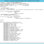
Simple linear models are, well, simple in R.  An example of a fairly easy linear model with two factors is:
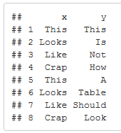
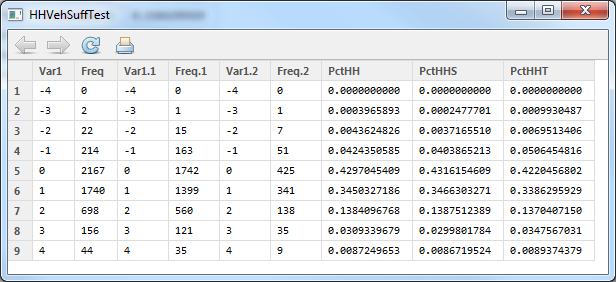
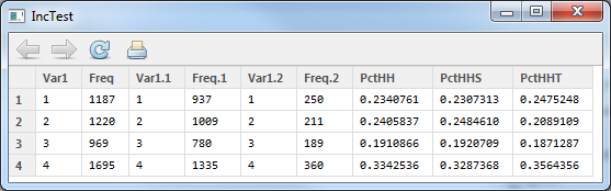
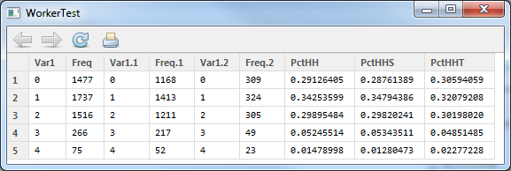
inTab.hbsh


This creates a simple linear home-based-shopping trip generation model based on workers and household size.  Once the estimation completes (it should take less than a second), the summary should show the following data:


> summary(hbsh.lm.W_H)

Call:
lm(formula = N ~ Workers4 + HHSize6, data = hbsh)

Residuals:
    Min      1Q  Median      3Q     Max 
-2.2434 -1.1896 -0.2749  0.7251 11.2946 

Coefficients:
            Estimate Std. Error t value Pr(>|t|)    
(Intercept)  1.79064    0.10409  17.203  < 2e-16 ***
Workers4    -0.02690    0.05848  -0.460    0.646    
HHSize6      0.24213    0.04365   5.547 3.58e-08 ***
---
Signif. codes:  0 ‘***’ 0.001 ‘**’ 0.01 ‘*’ 0.05 ‘.’ 0.1 ‘ ’ 1 

Residual standard error: 1.649 on 1196 degrees of freedom
Multiple R-squared: 0.03228,    Adjusted R-squared: 0.03066 
F-statistic: 19.95 on 2 and 1196 DF,  p-value: 3.008e-09


What all this means is:


Trips = -0.0269*workers+0.24213*HHSize+1.79064


The important things to note on this is that the intercept is very significant (that's bad) and the R2 is 0.03066 (that's horrible).  There's more here, but it's more details.


Non-Linear Least Squares


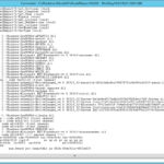
When doing a non-linear model, the nls function is the way to go.  The two lines below create a trips data frame, and then run a non-linear least-squares model estimation on it (note that the first line is long and wraps to the second line).


trips=3),
start=c(a=1,b=1),trace=true)


The second line does the actual non-linear least-squares estimation.  The input formula is T=a*e^(HHSize+b).  In this type of model, starting values for a and b have to be given to the model.


The summary of this model is a little different:


> summary( trips.hbo.nls.at3p)

Formula: T.HBO ~ a * log(HHSize6 + b)

Parameters:
  Estimate Std. Error t value Pr(>|t|)    
a   1.8672     0.1692  11.034  < 2e-16 ***
b   1.2366     0.2905   4.257 2.58e-05 ***
---
Signif. codes:  0 ‘***’ 0.001 ‘**’ 0.01 ‘*’ 0.05 ‘.’ 0.1 ‘ ’ 1 

Residual standard error: 2.095 on 402 degrees of freedom

Number of iterations to convergence: 4 
Achieved convergence tolerance: 1.476e-07 


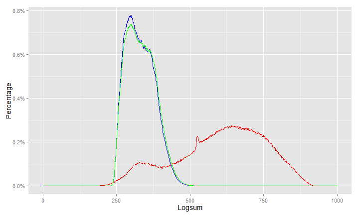
It doesn't perform R2 on this because it can't directly.  However, we can because we know the actual values and the model predicts the values.  So, one thing that can be done is a plot:


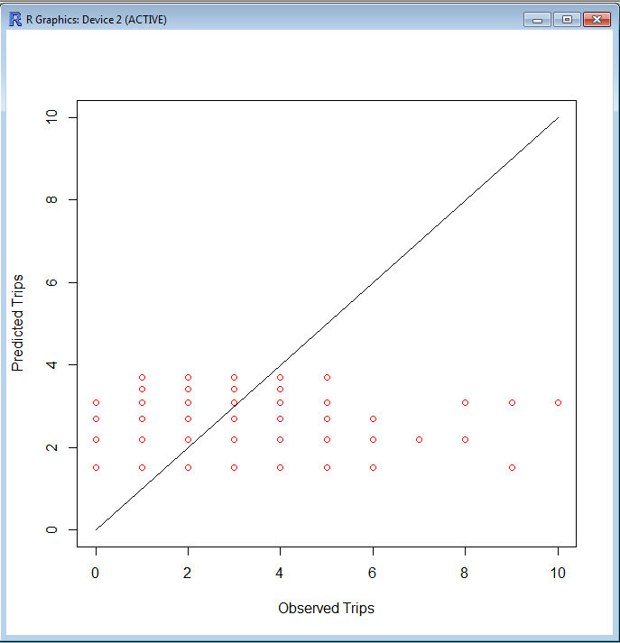
> plot(c(0,10),c(0,10),type='l',xlab='Observed Trips',ylab='Predicted Trips')
> points(subset(trips,AreaType>=3)$T.HBO,fitted(trips.hbo.nls.at3p),col='red')


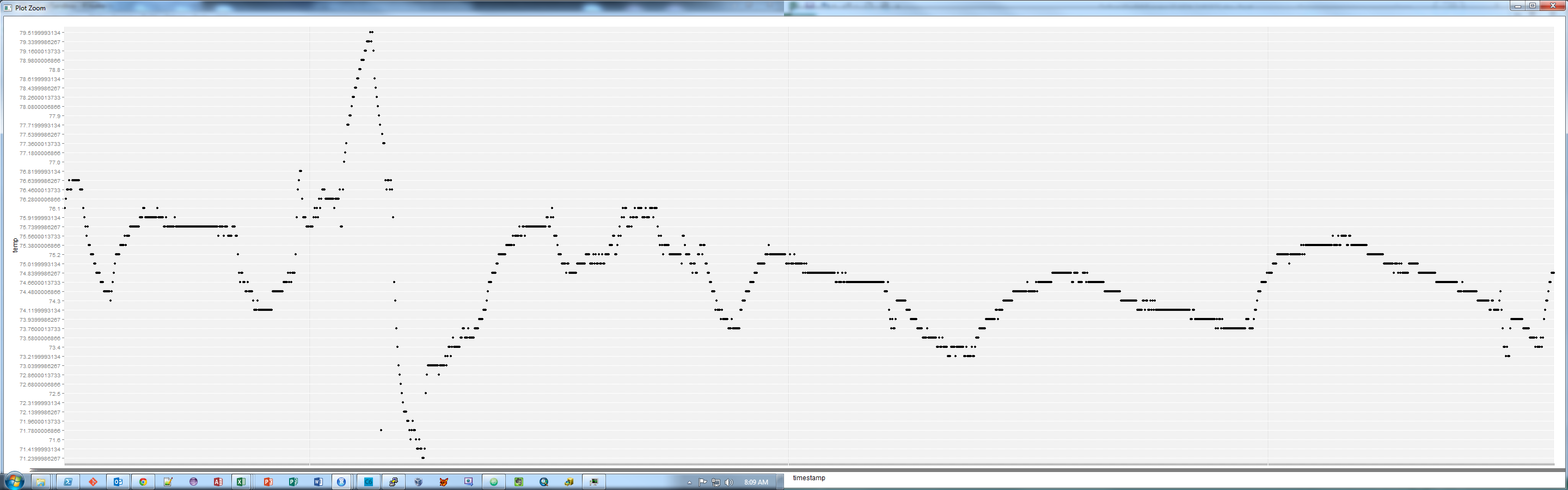
The resulting graph looks like this.  Not particularly good, but there is also no scale as to the frequency along the 45° line.
rgraph


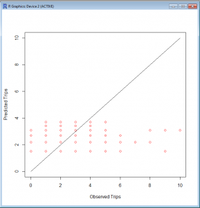
R2 is still a good measure here.  There's probably an easier way to do this, but this way is pretty simple.  


testTable=3)$T.HBO,fitted(trips.hbo.nls.at3p)))
cor(testTable$X1,testTable$X2)


Since I didn't correct the column names when I created the data frame, R used X1 and X2, as evidenced by checking the summary of testTable:


> summary(testTable)
       X1               X2       
 Min.   : 0.000   Min.   :1.503  
 1st Qu.: 1.000   1st Qu.:1.503  
 Median : 2.000   Median :2.193  
 Mean   : 2.072   Mean   :2.070  
 3rd Qu.: 3.000   3rd Qu.:2.193  
 Max.   :23.000   Max.   :3.696  


So the R2 value is pretty bad...


> cor(testTable$X1,testTable$X2)
[1] 0.2755101


It's better than some of the others, after all, this is semirandom human behavior.


That's it for now.  My next post will be... MORE R!


Also, I have a quick shout-out to Jeremy Raw at FHWA for help via email related to this.  He helped me through some issues via email, and parts of his email helped parts of this post.


New Project In the Works

May 31st, 2013

I haven’t worked in R in several days because I’ve been working on a new project that will assist with getting good transit speed curves from highway data.  The project is in Java and is on my Github page.

I’m working on making part of it multi-threaded, which is new to me.

A second project that is still in my mind (and I’m not sure if this will become part of this one or another separate project) will be to use transit GPS traces to get good trip length frequencies on transit.

Stay tuned!

Getting Started in R

May 24th, 2013

Setting Up

Download R from http://www.r-project.org. Install it normally (on Windows)… Double-click, next, next, next, etc.

Create a project folder with your data and with a shortcut to R (shout-out to Brian Gregor at Oregon DOT for this little trick). Also copy/move the data CSV there.

Inputting and Looking at Data

The data is in CSV, so we need to load the foreign library, and then we’ll load the data. I’m not a fan of typing in long filepaths, so I use the file.choose() function to browse for the data. Note that in many cases the

inTab<-read.csv(file.choose())
summary(inTab)

In the code above, we’ve loaded the dbf into the inTab data frame (a data object in R) and got a summary of it. There’s a few tricks to see parts of the data.

inTab$HHID (only the HHID values)
inTab[1:2] (only the first two fields)
inTab[1:10,] (only the first 10 rows)
inTab[1:10,1] (only the first field of the first 10 rows)

Data can be charted in R as well. A simple histogram is very simple to do in R.

hist(inTab$HHSize)

Sometimes data needs to be summarized. There is a function to do that, but first you’ll probably have to download a package. To download the module, go to Packages – Install Packages. From the list, find plyr and install it.

Once plyr is installed (it shouldn’t take long), you can load the module and use ddply to summarize data.

library(plyr)
inTab.Per<-ddply(inTab,.(HHID,HHSize6,Workers4,HHVEH4,INCOME,WealthClass),
AreaType=min(HomeAT,3),summarise,T.HBSH=min(sum(TP_Text=='HBSh'),6),
T.HBSC=sum(TP_Text=='HBS'),T.HBSR=sum(TP_Text=='HBSoc'),T.HBO=sum(TP_Text=='HBO'))

Where inTab is the input table, .(HHID,HHSize6,HHVEH4,INCOME,WealthClass) are input fields to summarize by, AreaType=min(HomeAT,3) is a calculated field to summarize by, and everything following ‘summarise’ are the summaries.

Conclusion

This is a crash course in R, and in the last steps, you basically computed average trip rates.  Next week’s post will be to run linear and non-linear models on this data.

A Self Instructing Course in Mode Choice Modeling

May 20th, 2013

One thing to ensure you understand how your software of choice works is to compare it to known outcomes. Â For example, while learning Biogeme, I converted and ran some of the scenarios in A Self Instructing Course in Mode Choice Modeling in Biogeme and found interesting issues where certain values coming out of Biogeme were the reciprocal of those in the manual. Neither is wrong, but when applying the data to a model, you have to know these things.

I’ve decided to do the same thing in R, and I had a lot of problems getting the CD. I luckily found one on my hard drive. It is here.

For the sake of making life easier on anyone that gets here looking for the manual, it’s here.

New Series on R in Transportation Modeling [Updated 10 October 2013]

May 17th, 2013

I’ve been doing a lot of statistical stuff over the past several weeks, and I think it is worth some value to the Interwebs if I try and post some of it.  I’m considering making it a course of some sort with some scrubbed HHTS data (no, I can’t post real peoples’ locations and names, I think I might get in a little bit of trouble for that).

The “syllabus” is roughly something like this (last update: 10 October 2013):

  1. Intro to R: getting data in, making summaries
  2. Trip rates – Linear and Non-linear modeling 6/7/13
  3. Mode Choice Estimation in R 6/14/13
  4. Trip rates – Averages 9/13/13
  5. Complex Mode Choice Estimation in Biogeme <-Coming in two weeks or less!
  6. Distribution Friction Factors
  7. Distribution K Factors
  8. Outputs and Graphics

I can’t guarantee that these will be the next eight weeks worth of posts – there will probably be some weeks with a different post, since I don’t know if I can get all this stuff done in six weeks, even with the head start I have.

In other news…

I’ve been disabling comments on these short posts that really don’t warrant any sort of responses.  I’ve been getting a lot of spam on this blog, so I’m cutting it down where I can.  This is not a global thing, I’ve been turning them off on certain posts, but the default is on.

T-Test Trivia

May 13th, 2013

Any statistical test that uses the t-distribution can be called a t-test. One of the most common is Student’s t-test, named after “Student,” the pseudonym that William Gosset used to hide his employment by the Guinness brewery in the early 1900s.  They didn’t want their competitors to know that they were making better beer with statistics.

From The Handbook of Biological Statistics.

TRB Applications Conference Mobile Website

May 3rd, 2013

For those going to the TRB Transportation Planning Applications Conference in Columbus, Ohio next week (May 5-9), I’ve released a very simple mobile website for it.  I have part of an API designed into the site, and I intend to continue that with the next Applications Conference, as I want to see a mobile/tablet app happen.  I can make some Android platform stuff happen, but I have no iPhone development experience nor do I have an iDevice to do that on.

In addition, I’d love to see people that tweet during the conference to use the hashtag #TRBAppCon.  I will be tweeting (sometimes) and taking some pictures during the conference.  My twitter handle is @okiAndrew.

 Next up…

The day I’m writing this (I generally schedule posts anywhere from a day to 2 weeks in advance), I read the sad news that Astrid was acquired by Yahoo!.  I’m no fan of Yahoo!, in fact, I’m quite shocked they’re still in business.  I see this as the end of Astrid, so my next post will likely be about my solution to this problem.

Web Hosting and Stuff I Don’t Want To Deal With

April 26th, 2013

This was originally written over at my other blog, but it deals with both sites, so I figured I’d put it over here.  This is literally a direct copy-paste, so the part about “people on Twitter know” refer to people that follow me on one of my other Twitter accounts, @KE8P.

Those on Twitter already know that I’ve been tasked with managing the club email list because I am the secretary of the Milford Amateur Radio Club.  I asked on Twitter if anyone had any hints and I mostly got sympathy.

So I looked for something, and stumbled upon CiviCRM that looks like it may help.  CiviCRM is an open-source Customer Relations Management system that looks pretty cool.

The problem is, it requires MySQL 5.1.  That’s not a problem FOR THEM.  It’s a problem FOR ME.  I use GoDaddy shared hosting, and they have resisted every MySQL upgrade since 5.0.  So I looked at GoDaddy’s forum, and found a cornucopia of people demanding it, all met with the same response of “we have no plans to upgrade that on the shared hosting plans, but buy a Virtual Private Server (VPS) or Dedicated Server.  Now, I pay about $100 per year for “Ultimate Shared Hosting”.  A dedicated server is $100 PER MONTH.  A VPS is $30 (ish) per month.

Mind you, the shared hosting works perfectly for me, as it’s cheap (I make no money from my websites, neither directly nor indirectly.  I don’t have the money to go to a dedicated server, nor do I have the money to go with a VPS, and if I did, I wouldn’t because I don’t want the added workload of administering a server.  I used to do that, and I got away from it because I wanted to spend time on content rather than computer administration duties.

So here I sit.  Via Twitter, I’ve received recommendations for BlueHost, DreamHost, Linode, and WestHost (and had a nice twitter conversation with an account manager from WestHost).  I haven’t made up my mind, and my hosting contract with GoDaddy is up in June.  I’ve enjoyed great up-time and service from GoDaddy in the past, but running several versions behind on the backend database is not only an annoyance (for not being able to use CiviCRM), but it is absolutely frightening to think that I may have other peoples’ emails in a database on a server that isn’t being kept up-to-date with security patches.

GoDaddy, you have a week to meet my requirements.  Upgrade to the latest MySQL.  Else, Daddy, you’ll Go.  Moving is a pain, but I will do what I have to do.  And that is NOT a promise.  I may decide to leave anyway because

-73-

So anyway, by the time you’ve read this, it is on a different server.  I’ve moved the sites over and double-checked everything.  Email is working, CiviCRM is working (except the parts I haven’t setup), and if you read this, the site is working!

Quick Notes for the Week

April 19th, 2013

I didn’t have anything big to write on this blog this week, but there’s a few things out there worth a look.

In my other life, I’m an amateur radio operator.  I wrote a piece over on my other blog about the global economy and parts, as I have been buying parts from eBay at dirt-cheap prices.   This has continued implications on freight in this country.  It’s likely to get worse, as the makers-turned-entrepreneurs are (in droves) sending things off to China for fabrication.  Designed in the USA, made in China.

Mike Spack over on his blog mentioned that the one feature every traffic counter must have is identification.  He’s 100% correct.  I’ve seen a video of the Boston bomb squad blasting a traffic counter with a water cannon many years ago, and that’s what happens when you don’t put some sort of ID on your counters.   The orginal video of the counter’s demise has long since disappeared from the Internet, but you can still see the reference on Boing Boing.


Prepping my Computer (for a conference, but that part doesn’t matter)

April 12th, 2013

Update July 24, 2014: I’m using these exact directions with Linux Mint, which is my current preferred Linux Distro.

Note: I thought I posted this last January, but it appears I didn’t. 

This post could be re-titled “Why I Love Linux” because it requires Linux.

Like many other transportation geeks, I’m getting ready to go to this little conference in Washington, DC.  I’ve been getting things together because I found out a few years ago that being stuck in DC with problematic technology (like a bad cell phone battery) is no fun.  And to top it all off, my laptop feels like it has a failing hard drive.

So I booted into Ubuntu and used Disk Utility to check the SMART status via disk utility.  Which claims everything is fine.

Still, though, I didn’t receive any disk with my laptop (it instead has a rescue partition) and my intuition disagrees with what my disk drive thinks of itself, so I decided the smart thing to do would be to arm myself with a few good USB flash drives.

The first USB flash drive is a live image of Ubuntu or Mint (or many other distros).

The second is my rescue partition image that can be restored to a new drive.  I got this by:

  1. Getting an image file using the ntfsclone command:

sudo ntfsclone -o rescue.img /dev/sda4

Where /dev/sda4 is the Lenovo rescue partition (as indicated in Disk Utility)

  1. Compress the rescue image

gzip rescue.img

  1. Split the image into 1 GB bits

split -b 1024m rescue.img.gz

(note: steps 2 and 3 can be combined with gzip rescue.img |split -b 1024m

I then copied these to a USB flash drive.


New Open Data StackExchange Site Proposed

April 11th, 2013

Stack Exchange Q&A site proposal: Open Data

All the cool kids are opening up data.

11 Guidelines of Doing Good Semi-Academic Presentations

April 5th, 2013

I’m writing this as I’m working on a presentation for the TRB Applications Conference.  I’m working on a presentation I can present, and my delusions of grandeur are such that I THINK I can present Open Source Tools to QC Transit Survey Data as well as Steve Jobs could present a new iPhone, but without the reality distortion field.

I’ve been to quite a few conferences of varying groups, and I would call these “semi-academic”.  Sometimes they are presenting research, but in many cases they are presenting an application of research.  There’s no selling, and the audience is generally captive.

1. The Presentation is to show your work and get attendees interested in reading your paper

In places where you aren’t required to post a paper, do so anyway.  Include the detail there.  Don’t include tables full of numbers in a presentation, highlight one or two important numbers (trends, alternative analyses, etc) and note conclusions.  Include the big tables in the paper.

If you don’t include a paper, upload a second presentation with more detail and/or use copious “slide notes”.  Seriously.

The last resort – go to WordPress.com or Blogger.com or something, build a blog, and post it there.  Or hang it on your agency’s website.  Or something else along those lines.

2. Don’t Include tables full of numbers

Even though I mention it above, it bears repeating.  Normally, we can’t read them in the audience.  Focus on one number.  For example, if you’re showing that a mode choice model works better when using transfers as part of the transit utility, show us the log-likelihood or/and the correlation coefficient for ONLY the best case without transfers and the best case with transfers.  Keep it simple.  If I want the standard error of individual values, I’ll look for them, and if I ask at the end of the presentation, direct me to the paper.

3. Just because you can read it on screen while authoring a presentation does not mean that your audience can read it on the projector

24 point font is a minimum.  Yes, I know PowerPoint’s list box goes down to 8.  That does not mean you should ever go down there.  Some people have sight problems, and those problems can be exacerbated by trying to see around peoples’ heads.

A second part of this has to do with being able to read the slides while you’re presentting.  Just because you can read your slides on your 19″+ monitors at the office when you’re 18″ away does NOT mean that you’ll e able to read them on a laptop with a 14″ or 15″ screen (or 17″ widescreen, which is about as small due to the scaling) from a few feet away.

4. Use pictures and talk about them

If your presentation has no pictures, you’re doing it wrong.  If you want your concept/idea/solution/innovation/etc (pick one), throw in a few pictures that illustrate a point (or something like that).  For example, in a presentation I’m working on now, I have a workplace location that is noted by Dilbert’s office building and him waving.  I think it gets the idea of “workplace” across to people, and most people know Dilbert.

More importantly, half my presentation is maps that I will talk about.  No text.  I have 7 slides with bullets, 2 or 3 with numbered lists, and that’s out of 30.  That’s about right.

5. Reduce, but do not remove bullets

There is a big push in many circles to remove bullets from presentations.  In an academic presentation, that’s damn near impossible.  Don’t give in to the hate, but try to reduce bullets as much as practical.

6. Expect there to be dissenting opinions

I’ve seen a fair number of people get “blasted” by industry professionals.  Don’t get mad about it.  They are normally not there to make you feel bad, and don’t feel bad about it.  A session moderator can recognize when someone is asking a real question as opposed to someone that has an ax to grind, and a moderator WILL step in if someone asking questions is out of line.

7. Do not use the Microsoft PowerPoint (etc.) templates

Rare is it that a Built-in Template works for a presentation.  Normally an agency or company has some nicer and more appropriate templates to use.  Use them.

This guideline does not apply if your presentation is short (e.g. 5 minutes) or it is a presentation in a non-professional setting (e.g. a hobby).

8. Do not read your slides

I can read quite well and so can the rest of the audience.  If you’re just going to read the slides, hand out your presentation (as good ‘ol tree-killin’ paper) and sit back down.  Don’t load your presentation on the laptop, don’t talk, and tell the session moderator to just skip you.

This is probably the biggest reason many people want to remove bullets.  No bullets means that you might have to (gasp!) TALK ABOUT your content!

9. Use Animations Sparingly

Do NOT use animations to simply put bullets on the screen.  However, there are times when animations are important for the point of illustrating an idea, showing a process, or just pure entertainment.

10. Do NOT use numbers for alternatives

I will forget about the numbers as soon as you change slides.  Give them names.  And for those that have used “Alternative 1” and “Alternative 1A”, there is a special place in Hell for you.

11. Have the similar delusions of grandeur to what I have

Find a person you think is a damn good presenter. Learn from them.  Try to present as effectively as they do.

While I can’t say that following these tips will make you the next great presenter, I CAN say that following these tips will help you NOT be part of the conversation that includes “THAT presentations was ATROCIOUS”  and hopefully get you more towards “THAT presentation was AWESOME!”

New Open Source ArcMap Tool Posted: Point Location Fixer

March 29th, 2013

I stumbled on a problem that seems to have no easy answer.  Working on the count stations layer here at the office, I found that we had a small number of points that weren’t located in the GIS feature class, although we DO have X and Y coordinates for them.

Since searching on Google turned up nothing, I wrote my own solution.  Since I already had some Java code to look for selected features and get to the actual features, I copied that code into a new project and made a few modifications.  Those modifications are posted on Github.  Even better, I actually used a few comments in this one! 🙂

Taking CSV Exported Cube Voyager Path Files to A New Level Using GAWK (part 1)

January 30th, 2013

In a prior post, I link to some code that outputs a path file.  I’ve done something a tad different because I needed some select link analysis and reading the path file in Cube was taking far too long to do it the normal way.

So, I took that program on Github and extended it to perform a selected link:

And this outputs a few GB of paths in CSV format.  I went from 42 GB of paths in the AM to 3.4 GB of CSV paths.  Still not good enough. The next thing I did was use GAWK to get just the Origin and Destination

This returns a CSV file of just the origin and destination (which can be linked to the vehicle trip matrix).

Part 2 will discuss how to link to a vehicle trip matrix and if this approach actually works!

New Website on Open Civic Hardware

January 23rd, 2013

I’ve started up a new blog that will hopefully be more maintained than this one: www.opencivichardware.org.  The idea of civic hardware came about from a presenter from Transportation Camp DC 2013.  Civic hardware are things created to help with a city (or state, or region).  It could be things like traffic counters, data loggers, tools to help with public involvement, or infrastructure.

The idea of this site is similar in nature to Hack-A-Day, but with a focus on civic hardware.  There will probably be a lot of things that can be cross-posted to both.  Additionally, look for things on this blog to be cross-posted there.

NFC Tag Differences

January 16th, 2013

I’ve been playing around with NFC tags a lot lately.  I have one with my contact info ready to go to a conference with me, I have one on my gym bag to open Endomondo and Google Play Music.  I have one on my keychain that opens a note for me of things I deem important if I’m going somewhere (the note is in Evernote, so I can change it pretty easily).

I originally bought a pack of tags and a keychain from tagsfordroid.com through Amazon.  These tags are pretty beefy.  In using NFC Task Launcher, I posted a twitter update that ultimately earned me two free tags from tagstand.  I noticed theirs seems much thinner.

The differences are substantial, as illustrated in the image below.

Substantial Difference


The tagstand sticker is a normal sticker thickness.  The tagsfordroid.com sticker is much thicker.

The image below shows the entire group – the two tags from tagstand and a stack of tags from tagsfordroid and a set of a dozen decals to apply to the tags so you know what your tags do.

The entire setup

Disclaimers:

While the tags provided by tagstand were free, they do this for anyone that downloads the NFC Task Launcher app and posts a twitter update using the application.  They aren’t aware I’m writing this, the tags were not provided to help write this, and I’ve not been offered any compensation for writing this.

I am not trying to show that one is better than the other.  Both tags work.  There are times one may want a thicker tag, and there are times that one may want a thinner tag.  The purpose of this post is to illustrate a difference between the two.


Reloaded Kindle Fire with AOKP… fixed navbar issue

January 9th, 2013

I loaded my old Kindle Fire with AOKP.  This is awesome!

But…

I had a problem in Facebook and Twitter. On Facebook, the application menu made the back, home, and application switch menu so small I had a bit of trouble using them.  On Twitter, there was no application menu button, so I couldn’t switch Twitter accounts (I have three Twitter accounts):

image

image

So I was poking around in the ROM Settings and ultimately stumbled on a solution. The solution is to add a fourth button to the navbar, set it as the menu, and leave well enough alone.

image

image

As illustrated in these screenshots, the problem is solved:

image

image

That’s it!

Reading a Cube Voyager Path File from Java

October 8th, 2012

As a follow-up to my prior post, this is how to use the Cube Voyager API to read a path file.  I highly recommend you read the other article first, as it talks more about what is going on here.

The Interface

The interface for the path reader is larger because of the return structure.  The code below includes the interfaces to the DLL calls and the structure for the path data returned by some of them.  Note that I didn’t do PathReaderReadDirect.  It doesn’t seem to work (or I’m not trying hard enough).

The Code

Once the interface is in place, the code is reasonably simple.  However, I’m seeing a few interesting things in the costs and volumes in both C++ and in Java, so I wouldn’t use those values.  I guess if you need to determine the costs, you should save the costs with the loaded highway network to a DBF file and read that into an array that can be used to store and get the values.

The Final Word… For Now

Java is a great programming language.  Using these DLLs can help you do some interesting stuff.  However, it seems that there are very few people using the API, which is concerning.  I personally would like to see an interface for reading .NET files and writing matrices.  But I can’t expect Citilabs to put time in on that when it seems there are so few people using it.


Reading a Cube Voyager Matrix from Java using JNA

October 5th, 2012

I’ve begun to really enjoy Java.  It’s hot, black exterior exposes a sweet bitterness that matches few other things in this world.  Oh, wait, this is supposed to be about the other Java – the programming language!

The “Holy Grail” of API programming with Cube Voyager to me has been using the API in Java.  I can program in C++ quite well, but I have a staff that can’t.  We’re likely going to be going to a Java based modeling structure in the next few years, so  it makes sense to write everything in Java and keep the model down to two languages – Cube Voyager and Java.

Setting up the Java Environment

There are three things to do to setup the Java environment to make this work.  The first is to place the Cube DLL in the right location.  The second is to get JNA and locate the libraries to where you need them.  The final is to setup the Java execution environment.

First, copy the VoyagerFileAccess.dll file (and probably it’s associated lib file) to C:\Windows.  It should work.  I’m using a Windows 7-64 bit machine, so if it doesn’t work, try C:\Windows\System32 and C:\Windows\System.

Second, get JNA.  This allows the Java compiler to connect to the DLL.  The latest version can be downloaded from Github (go down to “Downloads” under the Readme.md… just scroll down ’till you see it, and get both platform.jar and jna.jar).

If you’re on a 64-bit computer, the second thing to do is to set your jdk environment to use a 32-bit compiler.  I use Eclipse as my IDE, so this is done through the project properties.  One location is the Java Build Path – on the Libraries tab, make sure the JRE System Library is set to a 32-bit compiler.  In the Java Build Path screenshot below, you can see that all the locations are in C:\Program Files (x86) – this is an easy (although not foolproof) way to show that this is a 32-bit compiler.

Java Build Path Window

While you’re setting up stuff in this window, make sure the jna.jar and platform.jar are linked here as well (click “Add External JARs…” and locate those two files).

Another place to check in Eclipse is the Java Compiler settings, which should have “Use Compliance from execution environment…” checked.

The Programming

The thing that makes this work is this part of the programming.  You can see in this that I create an interface t0 the Voyager DLL file by loading the DLL, and then setup some pointer objects to hold the memory pointer variable (the “state” variable in all of these) and set up the functions to read from the matrix.

public interface voyagerDLL extends Library{
voyagerDLL INSTANCE=(voyagerDLL) Native.loadLibrary("VoyagerFileAccess",voyagerDLL.class);
Pointer MatReaderOpen(String filename, Pointer errMsg, int errBuffLen);
int MatReaderGetNumMats(Pointer state);
int MatReaderGetNumZones(Pointer state);
int MatReaderGetMatrixNames(Pointer state, String[] names);
int MatReaderGetRow(Pointer state, int MatNumber, int RowNumber, double[] buffer);
void MatReaderClose(Pointer state);
}

The next part that makes this work is the actual programming. In the code below, the first thing I do is define vdll as an instance of the voyagerDLL interface.  Then, I open a matrix file (yes, it is hard-coded, but this is an example!), get the number of matrices, zones, the names, and I start reading the matrix (in the for loops).  I only print every 100th value, as printing each one makes this slow a bit. The actual reading is quite fast.  Finally, I close the matrix and the program terminates.

Issues

The big issue I noticed is that if the matrix is not found, the Pointer variable returned by MatReaderOpen will be null, but nothing will be in the error value.  I’ve tried redefining the error value to be a string in the interface, but it does the same thing.  However, I don’t recall if it did anything in C++.  At any rate, there needs to be some error checking after the matrix is opened to ensure that it actually has opened, else the program will crash (and it doesn’t do a normal crash).

Next Up

The next thing I’m going to do is the path files.

Using the Voyager API for Path Analysis

August 3rd, 2012

Just posted on Github: Path2CSV

This is a tool that will read a Cube Voyager Path file and output the contents by node to a CSV file.  The code is written in C++ and available under the GPL3 license.


Interesting INT() Issue Between Cube and Excel

July 24th, 2012


I don’t know about anyone else, but I do a lot of calculation prototyping in Excel before applying that in scripts.  One of the most recent was to do a script to add expansion zones (also known as “dummy zones”, although they aren’t really dumb, just undeveloped!).

The problem I had was related to the following equation:

R=INT((819-N)/22)+1   Where N={820..906}

In Excel, the results are as below (click on it if it is too small to see):

In Cube, I got the result of (click on it to expand, and I only took it into Excel to move stuff around and make it easier to see):

Note the sheer number of zeroes in the Cube version and all the numbers are ‘off’.

The reason, as I looked into things was because of how INT() works differently in the two platforms.  In Cube, INT simply removes everything to the right of the decimal, so INT(-0.05) = 0, and INT(-1.05)=-1.  In Excel, INT rounds down to the nearest integer.  This means that negative values will be different between the two platforms.  Note the table below.

Excel Cube
3.4 3 3
2.3 2 2
1.1 3 1
0.5 0 0
0 0 0
-0.5 -1 0
-1.1 -2 -1
-2.3 -3 -2
-3.4 -4 -3

While neither software is truly wrong in it’s approach (there is no standard spec for INT()) it is important to know why things may not work as expected.

What Have I Been Up To Lately?

July 23rd, 2012

I’ve been up to a few things that haven’t made it to this blog.

First, I’ve done a few conversion tools for converting Tranplan/INET to Voyager PT and back again.  These are open-source tools that are meant to help, but they may not be perfect (and I don’t have the time to make sure they do).  If anyone wants to upload fixes, you’ll get credit for it (but you have to let me know, as I think I have to allow that in Github).

Next, I’ve been heavily working on QC of my transit on-board survey.  This has resulted in some more work being uploaded to Github.  I’ve written some to assist in trying to figure out what I need to actually look at and what is probably okay enough to ignore.

I’ve seen some stuff come out of the Census related to an API, and I did post some example code to the CTPP listserve to help.  Since I didn’t want to bog down some people with my code, I put it in a Gist (which is below).

This code will get Census data using their API and chart it.  Note that you have to install PyGTK All-In-One to make it work.  Of course, mind the items that Krishnan Viswanathan posted to the Listserve – they help make sense of the data!

I’m also working on an ArcMap add-in that will help with QC-ing data that has multiple elements.  It is on Github, but currently unfinished.  This is something for advanced users.

I will have a few tips coming for some Cube things I’ve done recently, but those will be for another blog post.  With that, I will leave with the first publicly-available video I’ve ever posted to YouTube.  Of a traffic signal malfunction.  I’m sure Hollywood will start calling me to direct the next big movie any day now… 🙂

Playing with Google Docs Scripts and Get Satisfaction

March 15th, 2012

Sometimes I do things that don’t really have a point… yet. One of them was pulling some information from GetSatisfaction (GSFN) to a Google Docs Spreadsheet (GDS). GSFN has an API that returns everything in JSON, so writing script in a GDS to pull in that information is quite easy.

The first step is to create a spreadsheet in Google Docs.  This will act as a container for the data.

The second step is to create a script to parse the JSON output and put it in the spreadsheet.  An example of this, which is a script I used to only get the topic, date, and type of topic (question, idea, problem, or praise).  It’s simple, and it can be expanded on.  But for the sake of example, here it is:

function fillGSFN() {
  var r=1; 
  for(var page=89;page<200;page++){
    var jsondata = UrlFetchApp.fetch("http://api.getsatisfaction.com/companies/{COMPANY}/topics.json?page="+page);
    var object = Utilities.jsonParse(jsondata.getContentText());
    var ss=SpreadsheetApp.getActiveSpreadsheet();
    var sheet=ss.getSheets()[0];
    
    for(var i in object.data){
      sheet.getRange(r, 1).setValue(object.data[i].subject);
      sheet.getRange(r,2).setValue(object.data[i].created_at);
      sheet.getRange(r,3).setValue(object.data[i].style);
      r++;
    } 
    if(i!="14") return 1; //This was not a full page
  }
}

This script is still a work in progress, and there are better ways to consume a JSON feed, but for what I was doing, this was a nice quick-and-simple way to do it.

Arduino Based Bluetooth Scanners

September 30th, 2011

This is a post about a work in progress…

If you’re in the transportation field, you’ve likely heard of the Bluetooth Scanners that cost around $4,000 each. These devices scan MAC (Media Access Control) addresses and log them (with the time of the scan) and use that for travel time studies or for origin-destination studies.

My question is, can we build something good-enough with an Arduino for much less money? Something like the concept below?


There’s reasons for everything:

Arduino

Controls it all and brings it together.  Turns on the GPS, Bluetooth, listens to the stream of data from both, writes to the memory card.

GPS

The Arduino has no real-time clock (meaning that unless you tell it what time it is, it doesn’t know!).  The GPS signal includes time.  It also includes position, which would be pretty useful.

Bluetooth

If we’re going to scan for Bluetooth MAC addresses, something to receive them might come in handy…

Something to Write To

Scanning the addresses would be pretty pointless without storing the data.

Initial Design


/*
Bluetooth Tracker
Written by Andrew Rohne (arohne@oki.org)
www.oki.org
*/

#include 
#include 

NewSoftSerial ol(10,11);

char inByte;
boolean ext=false;

void setup(){
  String btreturn;
  Serial.begin(115200);
  delay(1500);
  Serial.print("$$$");
  delay(1000);

}

void loop(){
  byte incomingByte=-1;
  byte index=0;
  char macaddys[160];

  while(Serial.available()>0){
    index=0;
    Serial.println("IN15");
    delay(16500);
    incomingByte=Serial.read();
    while(incomingByte>-1 && index<160){
      macaddys[index]=(char)incomingByte;
      index++;
      incomingByte=Serial.read();
    }
    if(macaddys!=""){
      Serial.end();
      writelog((String)millis()+":"+macaddys+"\r\n");
      Serial.begin(115200);
    }
  }
  if(Serial.available()<=0){
    delay(1000);
    Serial.begin(115200);
  }
    
}

void writelog(String line)
{
  ol.begin(9600);
  ol.print(line);
  ol.end();
}

The Results

The program wrote about 5kb of text to the file before dying after 489986 milliseconds (8 minutes). I had left it on a windowsill overnight (the windowsill is literally about 15 feet from Fort Washington Way in Cincinnati, which is 6 lanes (see below for the range centered on roughly where the setup was located).

There were 9 unique Bluetooth MAC addresses scanned. During the 8 minutes, there were 25 groups of MAC addresses written to the file. 5 MAC addresses appeared in multiple groups, with 3 of the MAC addresses appearing in 24 of the groups (and they may have appeared in the last group, it appears to have been cut off). Those same 4 have been seen in earlier tests, too, so I don't know what's going on there.

The Problems to Fix

Well, first there's the problem that I had let it run all night, and it only had 8 minutes of data. Something is causing the Arduino to stop writing or the OpenLog to stop operating.

In the output file, there are a few issues. First, some processing needs to be done, and second, it appears I am reading past the end of the serial buffer (if you look in the image below, you can see a lot of characters that look like a y with an umlaut).

In the code above, the IN15 command is sent to the Bluetooth Mate Gold, which tells it to inquire for 15 seconds, and then I delay for 16.5 seconds. This is because I THINK there is a delay after the scan finishes. I don't know how long that delay is. Vehicles traveling by at 65 MPH is 95.333 feet per second. Assuming I can get the Bluetooth device very close to the road, that 1.5 second gap SHOULD be okay, but if I have to go longer it could be a problem (the range of a Class 1 Bluetooth device is 313 feet, so a device can be scanned anytime in 626 feet (up to 313 feet before the Bluetooth Station and up to 313 feet after the Bluetooth station). A vehicle would be in range for about 6.6 seconds. However, the Bluetooth signal is at 2.4 - 2.485 Ghz, and is susceptible to some interference from the vehicle, driver, passengers, etc., so speed is key.

Conclusion

I'm on the fence as to whether or not the Bluetooth Mate Gold is the right way to do this. I will still be doing some research to see if I can get better speed out of it, or if I need to look into a different receiver that can receive the 2.4 GHz area and look for MAC addresses and stream them to the Arduino.

I also need to get the GPS up and running. That is a different story altogether, as I have been trying on that and have not been successful (despite using code that works for my personal Arduino and GPS, although the model of GPS 'chip' is different.

More Voyager PT + AWK Goodness

September 20th, 2011

One thing I’ve missed from the old TranPlan days was the reporting group.  We’ve used that for many years to compare our transit loadings by major corridor.  Unfortunately, that functionality was lost going to PT.  I still need it, though, and enter awk.

The script below looks at the transit line file and outputs ONLY the line code, comma-separated.  It uses a loop to check each field for ‘ NAME=’ and ‘USERN2’, which is where we now store our reporting group codes.

BEGIN{
FS=","
RS="LINE"
}
{
	for (i=1;i<20;i++)
	{
		if($i~/ NAME=/)
		{
			printf "%s,",substr($i,8,length($i)-8)
		}
		if($i~/USERN2/)
		{
			printf "%s\n",substr($i,9)
		}
	}
}

The contents of the above need to be saved to a .awk file - I used trn.awk.

To call this, I use a Pilot script to call awk and pass the input and get the output.

*awk -f {CATALOG_DIR}/INPUTS/trn.awk {CATALOG_DIR}/INPUTS/OKIROUTES.LIN >{CATALOG_DIR}/OKIROUTES.CSV

The output of this is a simple two-column comma-separated-value file of the route ID and the reporting group.

Using Gawk to get a SimpleTransit Loadings Table from Cube PT

September 19th, 2011

One thing that I don’t like about Cube is the transit loadings report is stuck in the big program print report.  To pull this out, the following code works pretty well:

gawk /'^REPORT LINES  UserClass=Total'/,/'^Total     '/ 63PTR00A.PRN >outputfile.txt

Where 63PTR00A.PRN is the print file. Note the spaces after ^Total. For whatever reason, using the karat (the ‘^’) isn’t working to find ‘Total’ as the first thing on the line. So, I added the spaces so it gets everything. Outputfile.txt is where this will go. It will just be the table.

NOTE: You need GNUWin32 installed to do this.

Using GAWK to Get Through CTPP Data

August 18th, 2011

The 3-year CTPP website lacks a little in usability (just try getting a county-county matrix out of it).

One of the CTPP staff pointed me to the downloads, which are a double-edge sword. On one hand, you have a lot of data without an interface in the way. On the other hand, you have a lot of data.

I found it was easiest to use GAWK to get through the data, and it was pretty easy:

gawk '/.*COUNTY_CODE.*/' *.csv >Filename.txt

Where COUNTY_CODE is the code from Pn-Labels-xx.txt where n is the part number (1,2, or 3) and xx is the state abbreviation.

NOTE: Look up the county code EACH TIME.  It changes among parts 1, 2, and 3.

This command will go through all .csv files and output any line with the county code to the new file.

UPDATE

I have multiple counties to deal with.  There’s an easy way to start on getting a matrix:

gawk '/C4300US.*(21037|21015|21117).*32100.*/' *.csv >TotalFlowsNKY.csv

This results in a CSV table of only the total flows from three Northern Kentucky counties (21037, 21015, 21117; Campbell, Boone, and Kenton county, respectfully).  For simplicity’s sake, I didn’t include all 11 that I used.

Finishing Up

Then, I did a little Excel magic to build a matrix for all 11 counties and externals.  The formula is shown.  I have an additional sheet which is basically a cross reference of the county FIPS codes to the name abbreviations I’m using.  See the image below (click for a larger version).

After this, I built a matrix in Excel.  The matrix uses array summation (when you build this formula, you press CTRL+Enter to set it up right, else the returned value will be 0).

Using these techniques, I was able to get a journey to work matrix fairly quickly and without a lot of manual labor.

NOTE

You need to have GNUWin32 installed to use gawk.


Using gawk to Get PT Unassigned Trips Output into a Matrix

July 15th, 2011

In the process of quality-control checking a transit on-board survey, one task that has been routinely mentioned on things like TMIP webinars is to assign your transit trip-table from your transit on-board survey.  This serves two purposes – to check the survey and to check the transit network.

PT (and TranPlan’s LOAD TRANSIT NETWORK, and probably TRNBUILD, too) will attempt to assign all trips.  Trips that are not assigned are output into the print file.  In PT (what this post will focus on), will output a line similar to this:


W(742): 1 Trips for I=211 to J=277, but no path for UserClass 1.

When a transit path is not found.  With a transit on-board survey, there may be a lot of these.  Therefore, less time spent writing code to parse them, the better.

To get this to a file that is easier to parse, start with your transit script, and add the following line near the top:


GLOBAL PAGEHEIGHT=32767

This removes the page headers. I had originally tried this with page headers in the print file, but it created problems. Really, you probably won’t print this anyway, so removing the page headers is probably a Godsend to you!

Then, open a command line, and type the following:

gawk '/(W\(742\).*)\./ {print $2,$5,$7}' TCPTR00A.PRN >UnassignedTransitTrips.PRN

Note that TCPTR00A.PRN is the transit assignment step print file, and UnassignedTransitTrips.PRN is the destination file. The {print $2,$5,$7} tells gawk to print the second, fifth, and seventh columns. Gawk figures out the columns itself based on spaces in the lines. The >UnassignedTransitTrips.PRN directs the output to that file, instead of listing it on the screen.

The UnassignedTransitTrips.PRN file should include something like:


1 I=3 J=285,
1 I=3 J=289,
1 I=3 J=292,
1 I=6 J=227,
1 I=7 J=1275,

The first column is the number of unassigned trips, the second column is the I zone, and the last column is the J zone.

This file can then be brought into two Matrix steps to move it to a matrix. The first step should include the following code:

RUN PGM=MATRIX PRNFILE="S:\USER\ROHNE\PROJECTS\TRANSIT OB SURVEY\TRAVELMODEL\MODEL\TCMAT00A.PRN"
FILEO RECO[1] = "S:\User\Rohne\Projects\Transit OB Survey\TravelModel\Model\Outputs\UnassignedAM.DBF",
 FIELDS=IZ,JZ,V
FILEI RECI = "S:\User\Rohne\Projects\Transit OB Survey\TravelModel\Model\UnassignedTransitTrips.PRN"

RO.V=RECI.NFIELD[1]
RO.IZ=SUBSTR(RECI.CFIELD[2],3,STRLEN(RECI.CFIELD[2])-2)
RO.JZ=SUBSTR(RECI.CFIELD[3],3,STRLEN(RECI.CFIELD[3])-2)
WRITE RECO=1

ENDRUN

This first step parses the I=, J=, and comma out of the file and inserts the I, J, and number of trips into a DBF file. This is naturally sorted by I then J because of the way PT works and because I am only using one user class in this case.

The second Matrix step is below:

RUN PGM=MATRIX
FILEO MATO[1] = "S:\User\Rohne\Projects\Transit OB Survey\TravelModel\Model\Outputs\UnassignedAM.MAT" MO=1
FILEI MATI[1] = "S:\User\Rohne\Projects\Transit OB Survey\TravelModel\Model\Outputs\UnassignedAM.DBF" PATTERN=IJM:V FIELDS=IZ,JZ,0,V

PAR ZONES=2425

MW[1]=MI.1.1
ENDRUN

This step simply reads the DBF file and puts it into a matrix.

At this point, you can easily draw desire lines to show the unassigned survey trips. Hopefully it looks better than mine!

Getting the 2nd Line through the Last Line of a File

June 24th, 2011

One recent work task involved compiling 244 CSV traffic count files and analyzing the data.

I didn’t want to write any sort of program to import the data into Access or FoxPro, and I didn’t want to mess with it (since it would be big) in Excel or Notepad++.

So, I took the first of the 244 files and named it CountData.csv. The remaining files all begin with ‘fifteen_min’ and they are isolated in their own folder with no subfolders.

Enter Windows PowerShell really powered up with GNUWin.

One command:
awk 'NR==2,NR<2' .\f*.csv >> CountData.csv

awk is a data extraction and reporting tool that uses a data-driven scripting language consisting of a set of actions to be taken against textual data (either in files or data streams) for the purpose of producing formatted reports (source: Wikipedia).

The first argument, NR==2 means start on record #2, or the second line in the file.
The second argument, NR<2, means end on the record less than 2. In this case, it always returns false, and thus the remainder of the file is output. The .\f*.csv means any file in this folder where the first letter is f and the last 4 letters are .csv (and anything goes between them). The ‘>> CountData.csv’ means to append to CountData.csv

Once I started this process, it ran for a good 45 minutes and created a really big file (about 420 MB).

After all this, I saw a bunch of “NUL” characters in Notepad++, roughly one every-other-letter, and it looked like the data was there (just separated by “NUL” characters).  I had to find and replace “\x00” with blank (searching as Regular Expression).  That took a while.

Acknowledgements:

The Linux Commando.  His post ultimately helped me put two and two together to do what I needed to do.

Security 102.  The NUL thing.

Emailing an alert that a model run is complete in Cube Voyager

March 6th, 2011

When you are doing many model runs, it makes life easier to know if the modelrun is complete.  The code is below.

SENDMAIL,
SMTPSERVER='MAILSERVER HERE',
FROM='from@somwehere.com',
TO='to@somewhere.com',
SUBJECT='Subject Line Here',
MESSAGE='Message Goes Here',
USERNAME='username',
PASSWORD='password'

The things you replace here are pretty obvious.  If you have questions about the SMTPSERVER parameter, ask your IT person.  Also, for Windows domains, the USERNAME parameter should be ‘DOMAIN\USERNAME’ (you may be able to use your email address, depending on your email setup).

Adding a Search Engine in Chrome to Track UPS Shipments

December 22nd, 2010

One of the cool features of the Google Chrome Browser is the ability to add search engines and search them from the address bar. This tip builds on that capability to track UPS shipments based on their UPS Tracking Number.

The first step is to go to the options menu by clicking on the wrench icon and going to Options:

The second step is to go to the Basics tab (or on Mac, click on the Basics icon)

Step 2: Manage Search Engines Step 2: Manage Search Engine (OS X)

The third step is to add the search engine.  On Windows, click Add, and then fill out the resulting form, on OS X, click the ‘+’ button and do the same.

Step 3: Add a Search EngineStep 3: Click on the '+' and add the search engine settings (OS X)

Windows Form:

Windows Form

The following are the items for the form:

Name: UPS

Keyword: UPS

URL: http://wwwapps.ups.com/WebTracking/processInputRequest?sort_by=status&tracknums_displ ayed=1&TypeOfInquiryNumber=T&loc=en_US&InquiryNumber1=%s&track.x=0&track.y=0

NOTE: The entire URL above should be one line with no spaces!

Click OK on everything (or in some cases, the red circle on OS X).  To use this, open Chrome, type ‘ups’ in the address bar and press Tab and enter the tracking number (copy-paste works well for this).

Type 'UPS' in the address bar...

...Press Tab, and paste your tracking number...

Once you press Enter, you will immediately go to the UPS website showing your tracking information.  In this case, my shipment won’t make it by Christmas.  Oh well.

...and see your tracking information